Step inside the marketer’s brain and you’re likely to find some healthy skepticism. Does this $50 Airbnb come with a three-digit cleaning charge? Will “free shipping” require my firstborn to clear customs? Why does this anonymous benefactor need a credit card number to give me my millions? (And how did he get my email?) Do “fully customized” landing pages secretly mean slower launches, a bulkier building process, or not-totally-customizable-but-hey-close-enough?
Not so—at least when it comes to landing pages. Just look to the customization masters at ecomm packaging company Packlane. They make retail-ready, custom corrugated mailer boxes, shipping boxes, and folding cartons for subscriptions, ecommerce, and gifts that can be as simple or fancy as your heart desires. And they get real meta when it comes to their customization. Not only is it a pillar of their service, it’s also instilled in their marketing with oodles of customized landing pages.
But do oodles of customized landing pages equal oodles of time? Oodles of effort? Oodles of conversions? We pulled the lid off a few of Packlane’s landing pages to find out how they use them to create speedy, beautiful, super-targeted campaigns.
It’s no secret that ecommerce is a highly competitive and fast-paced world—one with so many options, you can buy your chicken a leash for both casual and formal occasions.
No matter which ecommerce niche you’re in, keeping up often requires working fast to get new promotions to market. But the catch-22 is that your landing pages can’t look like they were created quickly. When they do, they undermine your campaign thanks to inconsistent branding, rushed copy, or poor-quality images.
Full disclosure, one of the reasons we approached Packlane is because we have serious :heart-eyes: for their gorgeous branding—and how seamlessly it’s woven into each of their landing pages. We asked Remy Tennant, Packlane’s Director of Growth, about getting pages published fast while running a tight design ship.
One launch comes to mind. We had to get a page up really fast to get this campaign out the door. We often work with an agency, but this was a complete DIY job for our marketing team with no development or design resources.
The page—where customers can apply to be featured as part of Packlane’s Custom Packaging Inspiration Gallery—is relatively minimal and, says Remy, “admittedly not our most beautiful.” But at an 18% conversion rate and climbing, it’s a rush job that’s more than delivering on its investment.
Image courtesy of Packlane (Click to see the whole thing.)
It’s also easy to duplicate and rework, opening the floor for testing and expansion within the campaign. “Word on the Lane” is a video series featuring Packlane customer stories, with a similar submission landing page (converting at a cool 23%) to add a multimedia element to their customer showcase.
Image courtesy of Packlane (Click to see the whole thing.)
Being able to build and customize landing pages quickly creates more breathing room for experimentation, lower-stakes launching, and higher margins of ROI. Says Remy:
On our own, the entire process of launching a page—from initial content creation, to picking a template, to building and customizing it—takes about four to six hours. Our marketing team can easily get a page up within a day, working completely in-house.
A more typical scenario for Packlane’s marketing team involves working with outside resources. Though their agency is an ocean and several time zones away, collaborating on landing pages is a simple process. Remy explains:
Our website is beautiful, but because it’s 100% custom, there is no CMS. Being able to collaborate with outside developers and designers on Unbounce without having to involve our internal tech team is a huge win. It saves time and allows our devs to focus on more important things.
Their “Size Matters” page, where customers can calculate custom sizing, is a ringing example of what this can accomplish. Pixel-perfect branding, slick design, animated graphics, and a dynamic calculator that gives recommended dimension and style options for your packaging make for a landing page that’s not only beautiful, but fully interactive.
Image courtesy of Packlane (Click to see the whole thing.)
It’s versatile, too. This page is used at several points of the customer journey, particularly as an onboarding and educational tool.
Our sales team and customer service team use this page to lead prospective and new customers through the customization process and help them figure out the right measurements for their packaging.
It’s simplified what can be a very complex and technical process, and has definitely helped convert more customers.
With great customization power comes great responsibility. Packlane offers endless packaging options—be it by style, size, material, design, and labeling. They service customers from all sorts of verticals within ecommerce, and they cater to all of their different needs based on product type, seasonality, and audience. It’s a tall order, pun intended.
How do they tackle this complexity? Custom landing pages for specific industries and campaigns. Instead of relying on visitors to browse their website, or talk to a sales rep, or sign up to see their smorgasbord of packaging options, Remy describes how Packlane comes to them with targeted landing pages.
Our custom cosmetics page is one of our most-visited pages and ranks pretty well for custom cosmetics packaging. We do a lot of SEO, and the ability to add metadata is obviously really important.
We’re also big into A/B testing—one page I recall saw a conversion lift of 15% after testing headlines—so we’re looking forward to running experiments with this page. Results TBD!
Image courtesy of Packlane (Click to see the whole thing.)
Seasonal promotions are another example. For ecommerce marketers, the holiday season brings more than just sleigh bells and eggnog and strained small talk with your distant uncle over a shrimp cocktail platter. It brings massive opportunity for sales and festive campaigns.
Packlane answered opportunity’s festive knock with their “winter wonderland” White Ink landing page. It showcases white-ink designs for Packlane’s customers to get their customers (didn’t lie when I said they get meta) in the holiday spirit. Plus, they get a free downloadable package with 30 holiday-themed design assets.
Image courtesy of Packlane. (Click to see the whole thing.)
The results put Remy in a merry mood, too:
This page gets a good amount of traffic as well, and was a great way to test different promotional techniques like the free graphics package. We’ll probably do something similar in the future.
So whether you’re in a mad rush, managing a lot of cooks in the kitchen, or creating a bunch of different pages for specific audiences with specific needs, it doesn’t have to be accomplished at the expense of brand quality. Just ask Packlane.
Customize your way
Ready to start building and customizing your own ecommerce landing pages? Publish as many as you want, for free, with a 14-day Unbounce trial. And if you have any comments or tips of your own you’d like to share, fire away below.
Here at Unbounce, we’re continuing to watch and adapt to COVID-19 as details emerge. But this isn’t business as usual for anybody—it’s uncharted territory, and it’s understandable that many of us are feeling anxious about what comes next.
Landing pages are certainly not top-of-mind for you at this time. Right now, you’re concerned about your health, your family, and your community.
But if worries about your campaigns and software subscriptions are piling stress onto an already stressful situation, we want to take that pressure off.
At Unbounce, we’re doing all we can to handle our side of things best for you, so you can take care of the things that matter most—whether that’s how we’re answering current, immediate questions from our customers, or determining how we can best help small businesses generally as things progress.
For customers, generally—here’s what we’ve heard from you:
Our teams have been talking to marketers across the industry spectrum. Here’s what you’re telling us you’re facing right now:
Many brands are in a rush to communicate crisis messaging. For instance, ecomm brands need to convey details of delayed shipping or supply chain interruptions to their audience. A great option for this is via popups and sticky bars on their site, or via email. Ideally, ecommerce brands are trying to cover all points of contact without creating more noise.
Some brands are struggling in unanticipated ways. Brick and mortar restaurants and small businesses are readjusting their business models to keep serving and keep people employed. Michelin-starred restaurants are offering takeout or delivery, and even very traditional shops are scrambling to create an online presence.
Some businesses are experiencing unexpected traffic surges at this time. Online learning platforms and mindfulness apps are seeing a huge surge of new traffic, exceeding their plans’ limits. They’re unsure how to best support their new audience or this volume of demand.
Travel-related businesses are being hit with booking cancelations and changes to their services, ultimately needing to find ways to address the current uncertainty about borders and international travel. Many events and conferences have been postponed or outright canceled, with a fast transition to online events where possible.
Agencies whose clients are cutting ad spend are in a rush to alter campaigns and promotional activities. Understandably, many are in watch-and-wait mode when it comes to making further investments in their PPC or social campaigns.
Again, everyone is figuring out what marketing even looks like in the current landscape. There’s been some cringe-worthy stuff hitting all of our feeds and inboxes, but we’ve also seen some genuinely helpful moves from companies, too.
How we’d like to help…
Right now, you might need to scale up or scale back on your operations. You might be pivoting to a new approach, or you might just need a helping hand figuring out your next move.
If you’re facing uncertainty, we’re best able to help if you reach out to us directly. We recommendstarting a live chat in the Unbounce builder (by selecting “contact us” in the ? dropdown) or via email at support@unbounce.com. We’re also available by phone at 1-604-484-1354.
We’re working from home like many of you, but we’re also all hands on deck and are scheduling one to one calls to work out the right approach for your business. We know software costs can be stressful in a crisis, so we want to help—whatever that looks like for you.
What’s more, we can set up a strategy session with our Success Managers for you as an existing customer. We want to help put your best page forward with a page audit, and give you some tips for converting based on what we know about your industry and offer. Simply get in touch, and we’ll get you scheduled.
If you’re in healthcare, education, nonprofit, or government—we’d like to give you our essential plan for free.
If you work in these industries, and sign up before June 1st, our landing page builder is open to you for three months at no cost. You offer mission-critical services that are needed more than ever, and this is the least we can do.
We’ll ensure you get setup help via our onboarding team and that you’re equipped to get up and running with whatever you need. This can include training on how to build a popup or sticky bar for your site for crisis comms, or new offers you might have, for example.
To clarify: this is open to everyone in healthcare, education, nonprofit, or government, and there’s absolutely no obligation that you continue as our customer afterward.It’s an essential plan available free, for a 3-month duration, from the time of your sign up.
Simply sign up for a trial via our pricing page, thenemail onboard@unbounce.com (or reply to any of our onboarding emails) with the industry you’re in and your request to get essential for free. From there our specialists have you covered. They’ll reach out, confirm your industry, and ensure you won’t be billed.
Also, we’re looking to create or curate content most useful to small businesses sorting out the marketing landscape.
Finally, we’d like to be a resource in uncertain times—we’re just working out what that looks like right now. Across our marketing channels, our business-as-usual content on conversion optimization doesn’t seem like the most helpful thing in the current climate so that’s on pause for a bit.
Instead, we’re focused on how we might help you navigate the marketing landscape when things are uncertain, and we’re asking what you might find useful.
On social media, you’ve specifically asked us about:
Working in higher stress environments and how to handle fear from clients
How small companies can quickly regain visibility after the crisis has ended, get back in touch with customers, and boost business again
Remote team building tactics and how to best transition to remote work
Improving existing marketing skills on teams, or helping the newly unemployed who want to gain these skills
Over the next few days, our team is looking into what we might be able to curate on the above. We may not be able to speak as an authority on all the topics you’re looking for at this time—so we’re mindful of striking a balance. We may not know how to keep the kids from driving you nuts on Zoom calls—but we do know how to curate a helpful resource. (At least, we like to think we do.)
We’re here when you need us.
We continue to be inspired and humbled by all of the kick-ass things that you’re all doing, even outside of challenging times. Whether you’re moving full-steam ahead on adjusting your approach or taking a necessary break to ensure your own health or that of your family, we’re with you.
If you need immediate assistance with your Unbounce account, use the live chat or support email mentioned above. But comments on this post are also open, you can reach out on Twitter, and we’re ready to show you what we mean when we say we’re people-first.
It’s the kind of mega-growth story anyone starting a software-as-a-service (SaaS) company dreams about.
You and a couple of friends have an idea for a product that fits a clear gap in the market. You pitch at a local startup event, which lands you in a growth accelerator, which also leads to your first seed funding. You spend that money hiring and building out the software. Before long, you’re closing your Series A, then your Series B. You’ve turned that original idea into a fast-growing SaaS platform serving hundreds of customers.
The co-founders of Vancouver-based Procurify—Aman Mann, Eugene Dong, and Kenneth Loi—made that dream a reality. As of 2019, the spend management company has raised over $30 million in funding, counts Mark Cuban and Ryan Holmes among its investors, and is one of the most exciting tech startups in the city.
But as with any SaaS investment, the influx of capital came with a catch. Procurify’s marketing team was under more pressure than ever to keep their growth going—even accelerate it. If they were going to hit their bold new revenue targets, they needed a way to kick customer acquisition into overdrive.
Meet Mark. Mark knows how to engage prospects and get ’em excited about SaaS. Be like Mark.
That’s where Mark Huvenaars and Jendi Logan come in. We had a chance to talk to Mark, the Demand Generation Manager at Procurify, during Unbounce’s 2019 Call to Action Conference. We also spoke with Jendi, Procurify’s Marketing Web Designer, over the phone.
Mark and Jendi told us how the marketing squad overhauled their strategy to become more purposeful in the way they pursued new customers. They did a bang-up job, too. Over several months, Procurify’s team:
Developed an innovative outbound marketing strategy that would help them connect directly with prospects in an engaging way.
Built 50 super-personalized landing pages with a 38% demo rate in a pilot account-based marketing (ABM) campaign.
Started pairing landing pages with video ads, which have a cost-per-conversion that’s just 1/4 what they were paying with search ads.
We were totally blown away by Procurify’s execution of account-based marketing campaigns using Unbounce—and by just how easy it’d be for other SaaS brands to try, too.
Here are some of the highlights from our chat with Mark (but read on for the deep-dive into Procurify’s story):
The Challenge: Increase Awareness & Schedule More Targeted Demos
At Procurify, we’re in full-on growth mode. We’ve expanded our teams. We’re looking at new systems, new tools, new ways to maximize our growth. Our goals have really been elevated.
That’s the dynamic environment Mark steps into when he joined Procurify early in 2019. The company had surpassed 100 employees and was close to securing its Series B funding. It was that exciting, precarious stage for a startup trying to scale up, and there was big pressure on the revenue unit to find another gear.
The Procurify crew playing it surprisingly cool. (They’re poppin’ champagne bottles in their hearts.)
Procurify’s software helps companies streamline purchase requests and approvals. It’s an ideal solution for small and medium businesses, Procurify’s target market. The trouble was that lots of the people who could benefit from the software didn’t know it existed. In fact, most didn’t even recognize they had a problem that needed solving.
At the time, we were really focused on inbound. Someone would conduct a Google search for purchasing software, they’d go into a landing page, and they’d book a demo.
That works when there’s a lot of search volume, but to scale up, we also needed to reach people who aren’t actively looking for purchasing software yet.
The biggest obstacle Procurify faced was awareness. The marketing team needed to develop an outbound marketing strategy that would get their product in front of the people who needed it most. They knew if they could demo the product, people typically started trials of the software at a high rate.
So, the Procurify crew decided to try something new: account-based marketing (ABM). An increasingly popular approach for selling SaaS products, an ABM campaign focuses just on companies matching your ideal customer profile. In practice, Procurify would reach out directly to prospects that were a great fit for the solution based on indicators like business size and industry.
We created an outbound team whose focus is building personalized campaigns and experiences that pull people through the funnel—helping them recognize their spend management problem and letting them know about Procurify as a solution.
Procurify had lots of ideas for ABM campaigns that could get the attention of decision-makers at target companies. After, they’d point these prospects to custom-made landing pages that described the benefits of the platform and encouraged them to schedule a demo. But this newly-formed outbound team didn’t have the technical skills to build pages on their own—and with just one designer, it was going to be a challenge to pull off.
The Solution: Account-Based Marketing (ABM) with Personalized Landing Pages
That’s when Procurify found Unbounce.
Jendi explained how the landing page platform has been key to enabling the company’s more nimble marketing strategy:
It’s my job to make sure we’re consistent in the way that we visualize Procurify’s brand story. But as the only designer on a growing team, I also don’t want to be a roadblock to execution.
With Unbounce, I can create branded templates so the team can actually do things themselves. They can modify it to match their campaign and have the confidence to go conquer the world themselves.
For Mark, the value of Procurify’s new library of landing page templates can’t be overstated.
It’s great when we’re running a campaign and we need something up tomorrow, or today, or even in an hour.
I know that I can hop into Unbounce, I can use one of Jendi’s templates, and it’ll be an experience for a prospect that’s far better than what I’d be able to build with any other tool.
Procurify collects leads through Unbounce-built signup pages for educational webinars. (Click to see the whole thing.)
Procurify’s marketing team can now get on-brand, campaign-specific landing pages up and running in no time. That’s given them the independence they need to execute on outbound marketing initiatives like ABM.
Here’s an example of a pilot ABM campaign the Procurify team set up that combined direct mail and Unbounce landing pages to connect with target accounts. First, the team identified 50 companies that fit Procurify’s ideal customer profile. Then they sent custom swag boxes outfitted with a video screen.
If you got one of these in the mail, you’d *at least* check out the landing page, right?
When people received these video boxes, they flipped it open, it would auto-play a video that’d say, “Hey, you at company.” It was highly personalized. And at the end of the video, it directed them to a dedicated Unbounce landing page.
Each page was tailored to address the prospect directly, including their name and company logo. At the bottom, it encouraged them to connect with a specific member of the Procurify sales team.
The upshot? A whopping 38% of prospects scheduled a Procurify demo from the ABM campaign landing pages:
This landing page is built to address *one person* at Procurify’s target prospect. Talk about personalization. (Click to see the whole thing.)
Beyond ABM landing pages like this, Mark, Jendi, and the team have been exploring other ways to get in front of prospects and tell the Procurify story, like with video ads on YouTube.
Video ads help us tell the Procurify story before people even know that they need a procurement solution. We can send them through to an educational landing page [from the CTA] and seed that intent.
Additionally, these ads really help us build our remarketing lists. So, not only do we capture someone’s attention from the onset—after they click through to one of our customized Unbounce landing pages, we can serve them up remarketing ads that speak to the video campaign itself.
An example of the sort of landing page Procurify might use in their video advertising. (Click to see the whole thing.)
The Results: 38% ABM Demo Rate & Way Lower CPC on Paid Traffic
Given the impressive results from their pilot campaign, Procurify is already planning new opportunities to put ABM into action. And because the marketing team can build personalized landing pages in a jiffy, they can now test and optimize their ideas a whole lot faster.
Here’s Mark’s big takeaway from that first ABM experience:
In addition to connecting with more than a third of target companies, we continue to see the viral impacts of people sharing these video boxes on social media. It was an exciting, unique way to kind of cut through the B2B clutter.
Here’s one of the responses Procurify got on Twitter. Clearly, they’ve made an impression.
Procurify’s increased focus on video advertising (paired with landing pages) has also been paying dividends. Not only is it a more compelling way to tell the brand story than with search ads, but it’s also significantly reduced Procurify’s cost-per-conversion (CPC) on paid traffic.
The clicks are relatively inexpensive, so we get a lot of traffic to our landing pages. While the conversion rate is only around 0.02%, it’s significant when you consider the volume.
Mark estimates that the CPC for a YouTube ad campaign is roughly 1/4 of what it’d be with search advertising. That’s a meaningful difference.
Get Your SaaS Startup Noticed with Landing Pages
As marketers at a fast-growing SaaS startup, Mark, Jendi, and the others faced more pressure to bring in customers than ever before. So, they got creative. They totally revamped their acquisition strategy and started talking more directly to their target prospects. Based on early results that showed a 38% demo rate for their ABM campaign, it looks like a slam dunk.
Mark credits at least some of that success to adding Unbounce to Procurify’s toolkit:
If I were to recommend Unbounce to another SaaS company, I would say it can grow with your growth. It’s highly scalable. It saves time, and it integrates with the marketing tech stack that you likely currently use.
What have we learned? In marketing, independence is key. It would’ve been really tough for Mark and the Procurify team to pull this off if landing page development and design had been a bottleneck. But armed with a bevy of on-brand templates (thanks, Jendi!), the marketing team is free to launch campaigns as fast as they can dream ’em up.
Wanna give ABM a whirl at your SaaS company? First, figure out how you’re going to get your product in front of decision-makers at your target accounts. Then drag-and-drop together a super personalized landing page that’s sure to get you noticed.
Effective ecommerce landing pages aren’t just about big logos and shiny product photos—they’re about giving shoppers the information, direction, and experience they need to smash that “Buy Now” button. Take a look at these hand-picked ecommerce landing page examples to make 2020 your best-selling year yet.
Why Not Just Use Product Pages for Your Ecommerce Campaigns and Promotions?
Pairing ads with product pages can lead to some pretty underwhelming results. According to Monetate, visitors convert half as often when they’re on a product page compared to a custom landing page experience.
That’s because most product pages don’t follow ecommerce best practices. They have boilerplate copy and design that tries to target everybody at the same time (and doesn’t sync up with your paid advertisements). Even worse—most product pages are stuffed with shiny links that end up distracting shoppers and keep them browsing instead of buying.
With landing pages, you can focus a visitor’s attention on a single product or offering and lead them on a personalized journey to purchase. They’re more targeted, customizable, and twice as likely to convert.
Not getting the results you want from sending traffic to your online store? Start building your own ecommerce landing pages today with a free 14-day trial of Unbounce.
Image courtesy of LIV Watches. (Click to see the whole thing.)
What This Ecommerce Example Reveals: You Need to Show Off Your Product in Different Ways
Typical online storefronts have a pretty standard approach to showing off their products. There’s probably a carousel of images at the top of the page and… well, that’s about it. But this example from LIV Watches shows how powerful it can be to spotlight your product throughout the page in multiple ways.
In this case, LIV is featuring a special edition wristwatch in partnership with pro cyclist TJ Eisenhart. Notice how, as you scroll down, they show the watch featured in different lights, different scenery, and different situations. You get to see a video overview of the watch, close-ups of the various features, and even a pretty slick side-profile that really shows off the craftsmanship.
It’s a great example of how ecommerce marketers can break the mold of “traditional” product landing pages to show customers the details they actually want to see.
What Else We Love About This Landing Page:
LIV creates a sense of urgency with this limited edition product. If you want this particular wristwatch, you know that you need to make a purchase decision fast. (Tick, tock.)
This brand is—in part—about lifestyle. That really comes through in the video, which explores idealistic sentiments like passion, aspiration, and truth to oneself.
All of the photography (along with the video and additional animations) really gives customers an up-close look at the craftsmanship, so they know exactly what they’re buying.
Image courtesy of TRIBE. (Click to see the whole thing.)
What This Ecommerce Example Reveals: You Can Make Special Offers to Close More Customers
Setting up limited-time deals or special offers on your regular ecommerce shop can be a huge pain. Standard product pages often don’t properly show off a deal, and they can be pretty rigid if, for example, you only want certain people to be able to access the promo.
That’s why this example from TRIBE is worth looking over. Their marketing team set up an “Exclusive Shortlist Offer” on a landing page, so they could carefully control who the promotion went out to—rather than make it available to every single visitor who happened across their website.
Better still, because this is a landing page built using Unbounce, the team from TRIBE had complete control over how they presented the promotion. To help sell the offer, the team incorporated the value of the deal into everything from the CTA (“Enjoy Your First TRIBE Box for £2”) to the subscription details (“Custom built pack and tailored to your needs”). Very smart!
What Else We Love About This Landing Page:
The focus on athletics throughout the page—including a great training photo underneath the hero section—helps visitors understand the value of these natural performance products, and who they are meant for. (Hint: not me.)
The emphasis on social proof helps make the offer more compelling as well. Not only are there testimonials from a recognizable customer review website, but there are also familiar media outlets and supermarket logos to increase your confidence.
Image courtesy of Ascent Footwear. (Click to see the whole thing.)
What This Ecommerce Example Reveals: You Should Focus on the Product Details Your Customers Care About Most
If you’re selling apparel that’s more function than fashion (like a shoe that’s designed to correct your walking stride), it’s important to put emphasis on the mechanics of how your product works. Case in point: this example from Ascent Footwear.
Not only does this landing page show off exactly what goes into each shoe, but it also explains why that makes such a difference. (Now, I just need to figure out what the heck “ample lateral stability” means.) The page removes all the fluff and focuses on answering one very specific question: How does this shoe actually work?
Compare this to most product pages, which often get lost in the details that don’t matter as much. Manufacturer references, lengthy product descriptions, related products—if your customers don’t actually care about these things, they might just be distracting them from making a purchase.
What Else We Love About This Landing Page:
Ascent uses an expanded view of its shoe to showcase the technical components that contribute to its comfort and durability.
By including an explainer video, Ascent is able to elaborate on the value propositions of the product without taking up much space on the page.
The clean, single-column layout and short length mean that visitors aren’t being overloaded with information. That way, they can focus on Ascent’s core message.
Industry: Cosmetic Model: Subscription Page Type: Lead Generation
Image courtesy of BoxyCharm. (Click to see the whole thing.)
What This Ecommerce Example Reveals: You Can Use Landing Pages to Build Hype for Product Launches
Launching a new product is always exciting—but getting the word out to customers can sometimes be a challenge. That’s where this example from BoxyCharm comes into the mix.
To help promote their new upscale beauty subscription box, their marketing team put together a promotional landing page that builds anticipation for the product and directs interested shoppers to enter their email address. This lead generation tactic proved to be quite useful—when the subscription box officially launched, the team at BoxyCharm already had a big list of shoppers who were interested.
Brains and beauty? This example really is the full package. 😉
What Else We Love About This Landing Page:
The sleek layout, on-brand color scheme, and parallax scroll effect all demonstrate that BoxyCharm has a flair for design. Nice.
The landing page copy helps BoxyCharm’s brand identity with the #hashtag generation, and the social links included make it easy for visitors to engage further.
The video gives us a look at the process behind the product and shows that BoxyCharm hears (and acts on) customer feedback.
Image courtesy of Thistle. (Click to see the whole thing.)
What This Ecommerce Example Reveals: You Should Always Optimize Your Landing Page for Mobile Devices
Making purchases on your phone is the new norm. According to Google, when people have a negative experience on mobile, they are 62% less likely to make a purchase from your brand in the future. That means for every page you create, you should be optimizing it for smartphones and tablets as well.
This example from Thistle shows how simple it can be to optimize your page for mobile devices. Using Unbounce, they created a landing page for their plant-based meal subscription service that looks stunning regardless of which type of device you’re using.
What Else We Love About This Landing Page:
The page does a great job highlighting the unique value proposition of this meal subscription service: nutrition-optimized, ready to eat, plant-based meals made with high-quality ingredients.
Thistle knows its audience. They understand how health-conscious their subscribers are, and made sure to include extra info about how each Thistle meal is curated to include the right mix of macronutrients, vitamins, and minerals.
Image courtesy of waterdrop. (Click to see the whole thing.)
What This Ecommerce Example Reveals: You Can Target Specific Audiences to Get Better Results
While your product pages typically have to be generic enough to speak to everybody at the same time, you can build landing pages to speak specifically to one particular audience or use case. This example from waterdrop sets the bar for targeted messaging—and, by converting more than half of all visitors, it makes a compelling case for you to do the same.
Everything on this page is meant for one audience: women. Contextual shots? Women. Testimonials? Women. This brand knows who they’re talking to, and their strategy seems to be working.
What Else We Love About This Landing Page:
The design is spectacular and complements the product well. Can colors be flavorful? This landing page says they can, and our abrupt craving for something sweet and fruity makes us believe it.
The page also does a good job of leveraging social proof by including recognizable media logos and positive customer reviews.
Example #7: Infinite Moon
Industry: Home Model: Storefront Page Type: Click-Through
Image courtesy of Infinite Moon. (Click to see the whole thing.)
What This Ecommerce Example Reveals: You Should Always Back Up Your Claims with Your Best Testimonials
Any ecommerce marketer will be able to tell you that reviews and testimonials are some of the most powerful tools in your arsenal. And this example from Infinite Moon and Wallaroo Media shows how you can use them more effectively on a landing page to make a sale.
Whereas on a typical product page you might just automatically surface up the latest customer reviews, the testimonials on this page have been carefully curated to help tell the brand story. Each one touches on an important benefit of Infinite Moon pillows: maximum comfort, serious pain relief, and high-quality materials.
What Else We Love About This Landing Page:
Using lightboxes to give visitors an up-close view of the product and provide additional information means that the page isn’t cluttered.
InfiniteMoon makes good use of the space above the fold, communicating their value prop through a punchy headline and emotive hero shot.
Image courtesy of Solo Stove. (Click to see the whole thing.)
What This Ecommerce Example Reveals: You Can Overcome Purchase Objections Using Photos and Other Multimedia
Are you relying on the fact that visitors will actually read your product descriptions? As a copywriter, I know as well as anyone that (and this is hard to admit) text and bullet points will only get you so far when it comes to overcoming purchase objections. A lot of shoppers skim or skip over the content you write, and they usually end up missing those key product details.
With ecommerce landing pages, you have the flexibility to overcome purchase objections in whichever ways you think will resonate most with your shoppers.
In this example from Solo Stove, their marketing team uses a combination of text and visuals to answer every possible question you might have about the product as you scroll down the page. (“What does it do?” It protects you from the flame. “Where am I gonna store all this?” It all nests inside the stove. “Can you still roast weiners?” With grooved ridges, this shield makes it easier than ever to get your wiener roast on.)
What Else We Love About This Landing Page:
Combining this product promotion with a limited-time 20% off pre-sale offer is a great way to encourage visitors to click through today, rather than wait until tomorrow.
The footer at the bottom of the page reminds shoppers that they’ll get free shipping, free returns, and a lifetime warranty. All of these promises help to eliminate risk and build trust in the brand.
Example #9: Nathan Sports
Industry: Sport Model: Storefront Page Type: Click-Through
Image courtesy of Nathan Sports. (Click to see the whole thing.)
What This Ecommerce Example Reveals: You Can Get More Creative with Promotions on Landing Pages
Consistent visual branding is more important than ever, but it does place limits on how imaginative you can be with your product pages. After all, they have to exist within the greater ecosystem of your online store. You can’t just go changing up the color schemes or formatting for every new product release!
But that’s why so many marketers are flexing their creativity with their ecommerce landing pages instead. Take this campaign from Nathan Sports, for example. It’s so different from the rest of their online store that it demands you take notice (and maybe put on some retro 3D glasses while you’re at it).
What Else We Love About This Landing Page:
The theme is so cool, and Nathan fully commits to it—from the loud, neon visuals, to the flashy animations, to the campaign slogan. Awesome.
This page might feel like it’s from another era, but today’s best practices still apply. Strong headline, benefits-oriented copy, rule- of-three layout—it’s all here.
Nathan even includes a custom playlist to help runners get pumped with retro jams from Duran Duran, Blondie, and Run DMC. Someone teach us how to run right now!
Example #10: Meowbox
Industry: Pet Model: Subscription Page Type: Click-Through
Image courtesy of Meowbox. (Click to see the whole thing.)
What This Ecommerce Example Reveals: Any Landing Page Can Be Improved With a Couple of Cat Photos
OK, I’m going to level with you. I was pretty much ready to finish this article… but I just couldn’t resist including this example. Meowbox is a monthly subscription box with toys and treats for your favorite feline. What’s not to love?
What Else We Love About This Landing Page:
It’s one thing for pet owners to say that Meowbox is wonderful, but pairing customer testimonials with pictures of their cats enjoying the treats adds another level of credibility.
The headline conveys Meowbox’s main value proposition and, paired with the hero shot, helps visitors understand what they’re getting as soon as they hit the page.
This is a click-through landing page, but Meowbox includes a newsletter signup form as a secondary conversion goal to try and capture those precious email addresses. No lead left behind.
But wait, there’s more! Take a page out of these ecommerce companies’ landing page playbooks
Example #11: The Savile Row Company
The Savile Row Company is a London-based online retailer that offers tailor- and ready-made shirts, suits, and chinos for men, as well as a selection of womenswear. Their website caters to UK, Europe, Australia, and US currencies and they ship all over the world. Smart cookies they are, the folks at Savile Row and their agency, Blimpp, saw this opportunity for targeting and created landing pages for specific segments—like their page for UK shoppers—which to date has converted 74% of thousands of visitors.
That whopper of a conversion rate is likely a reflection of how deeply targeted this page is. It’s not just for UK shoppers, or UK shoppers looking for men’s shirts, but UK shoppers looking for formal men’s shirts. Complete with everything a men’s-formal-shirt-shopper-in-the-UK needs to know about Savile Row’s fits, colors, styles, shipping, and more.
They’ve made great use of the page’s real estate by including a gallery of options and individual calls to action to shop each vertical within them. Slim fit? Navy blue? Button-down collar? Savile Row directs you exactly where you need to go. If you’ve even scrolled down, that is. The hero section has a clear product photo and CTA to grab a deal of three shirts for £80, along with the assurance of free UK returns, free posting and packaging for certain orders, and the credibility of a well-established company. Communicating that right at the top of the page may be all you need to click “Shop Now.”
Example #12: Woodworker’s Guild of America
Woodworker’s Guild of America is a woodworking community that offers tons of instructional and educational videos for woodworkers and woodworking enthusiasts. They have loads of content and products on their site for sale and download—instructional DVDs, online videos, apparel, tools, and more.
In this instance, they’ve cleverly used a landing page to promote their partnership with a popular industry manufacturer and further engage their community. Members can enter the Ultra-Shear Sweepstakes to win a package of Ultra-Shear woodturning tools, a grand prize nearly 54% of visitors so far have signed up to win.
This page hits the nail on the head (heyoooo) for several reasons. The page itself is simple and uncluttered, letting the prize take the spotlight. A clear graphic of the entire tool bundle and its hefty $1,120 USD value leave nothing up to interpretation, while the large Ultra-Shear logo communicates their alliance with a quality brand. All of this information is located above the fold, along with a simple form to enter. If visitors want more, they’ll find it below with a description of each tool included in the prize, its features and benefits, and a link to find more product details.
Example #13: The Coffee Network
The Coffee Network is an online marketplace based in Australia that connects home brewers, cafe owners, and office managers with local coffee roasters. Through TCN, they can choose from a huge variety of specialty and gourmet coffee and espresso blends to buy individually, as roaster bundles, or wholesale.
Their Coffee Finder landing page, converting at 45%, makes the search for the perfect brew even easier, guiding coffee lovers through a three-step process to customize their order based on roasting method, strength, and flavour preferences. The headline is super clear, benefits-led, and visitor-focused, with supporting copy that explains exactly why visitors should use the Coffee Finder right above a call to action encouraging them to give it a whirl. All of this is laid over a video background of a silky, rich coffee brew in progress.
Bonus points for the “How it Works” headline nudging visitors down the page, succinct instructions conveying the simplicity of the coffee-finding process, and charming iconography as visual communication.
Example #14: Heyday
Heyday is a New York- and LA-based skincare company that aims to make quality skincare and treatments accessible to everyone. They have several brick-and-mortar locations as well as an ecommerce shop and monthly membership, offering in-spa facials and retail skincare, a huge range of products purchasable online, and free expert content.
The page we’ve chosen to highlight—announcing the arrival of a new spa location in Silver Lake—is as simple as it is effective, and a stellar example of using landing pages to generate buzz and gauge interest well before a launch. Its beautiful, colorful design, unmissable emphasis on location, short blurb that summarizes Heyday’s unique selling proposition, and simple one-field form add up to a page that’s converted 65% of several thousand visitors. That means thousands of leads, thousands of validations that Silver Lake is a spot to open up, and of course, thousands of potential customers.
Blending in a chance to win a three-month membership and offering a bonus entry for following Heyday on Instagram certainly don’t hurt either, both as an added incentive to sign up and a chance for Heyday to further engage the local community.
Example #15: Xpand No-Tie Laces
Xpand is a no-tie, elastic shoelace system that can be installed on any shoe or boot to create adjustable, higher performing, fuss-free footwear. Since raising $1.2 million in crowdfunding to support their launch, they’ve quickly expanded their business and product offerings to meet demand.
As a relatively new product, Xpand’s “Freebie” landing page is a particularly smart way to draw in new customers. It offers a totally free pack of laces—no purchase required apart from the $2.99 shipping—so interested visitors can try out the laces before they buy them.
This page is heavy on building trust—besides the act of backing up their product with a free sample, Xpand has included several nods to their credibility. They let visitors know that over one million packs have already been sold, as well as adding a logo bar of media features (no big deal, they just appeared on Ellen). They also added a handy series of gifs showing how easily the laces can be installed, how they contour to the movement of your foot, and exactly what they look like in visible and hidden mode.
Example #16: Marley Spoon
Image courtesy of Marley Spoon. (Click to see the whole thing.)
Marley Spoon is a meal prep service that makes cooking quality, homemade meals super easy and convenient. They deliver fresh, locally-sourced ingredients for meals you’ve selected right to your door, with step-by-step recipes to whip them up in no time.
Their “Perfect Dinner” landing page draws visitors in with drool-inducing photos of a few delicious dinners you can create, then clearly and visually lays out their value propositions and a list of overall benefits to the subscriber. All peppered with bright, clear calls to action to “Start Cooking” once all those food photos have gotten you nice and hungry. The top of the page contains a navigation to see all of the current recipes on offer, learn exactly how their service works, and a gentle CTA to sign up. At this time, the page is converting at a cool 25%.
Spa De Soleil is a leading developer of private label, custom, and pre-formulated skin and hair care products. They offer everything from brand consultation, packaging, and graphic design to custom formulation and regulatory guidance for their clients.
This landing page, targeted at private labels, is a clever way of outreaching and educating prospective clients on their services. Its call to action is to download their private label handbook, allowing them to share their expertise and add to their credibility as leaders in the beauty industry. In lieu of a more direct call to action, they’ve decided to promote a content offering. Not only is this a softer approach for the visitor, it gives Spa de Soleil an opportunity to gain info on prospective clients with a detailed form that asks for company, type of business, products they’re interested in, location, and more.
The photo they’ve chosen for the hero section helps convey the research, development, and formulation services they provide—you can trust that they’re the ones behind every product created. They also instill trust with client testimonials and a list of certification logos, including USDA Organic, Natural Products Association, Cruelty Free, and more, backing up their commitment to natural and environmentally-conscious products. At the bottom of the page, they list only their customer service number, which adds to the feeling of helpfulness. It’s all about learning how Spa de Soleil can help the client instead of trying to sell to them right off the bat.
Example #18: ColdCalm
Boiron is a manufacturer of homeopathic medicines with a worldwide reach of 20 foreign subsidiaries and distribution in 50 countries. Their ColdCalm landing page, to promote one of their cold formulas, is a great example of customizing pages for targeted products.
It’s simple and to the point, with a clear headline and list of symptoms ColdCalm treats above two calls to action empathetic to someone who may be or know someone suffering from them—you can either locate a store to find instant relief or purchase online for future sniffles. An overview of benefits, safety, and product differentiators like quick-dissolving tablets and no known drug interactions address any immediate concerns.
Two customer reviews coupled with a list of reputable, well-known stores that sell ColdCalm create that sense of trust especially important in the healthcare industry. An extra touch, particularly for those interested in natural, homeopathic remedies, is a link to learn absolutely everything about the medication, from its ingredients and the symptoms they relieve, to storage and safety, directions, and more.
Example #19: Gradshop
Gradshop is a manufacturer and distributor of premium graduation apparel and accessories. They service over 1,000 schools across the world, from pre-schools to universities—so they have a LOT of orders, customers, and inventory to manage at any given time.
Their landing page to order a free graduation planning kit is a great way to streamline the purchasing and order customization process, and ensure customers are satisfied with their product choice before placing an order. This undoubtedly reduces the load on their support team to fix or return orders after the fact, and creates a better customer experience overall.
There’s no having to guess what’s included in the kit with a bullet list and photo examples detailing every item—a ton of free samples, color swatches, order forms, and a trusty ebook on graduation planning tips. Choosing a longer form with several information fields is a smart choice considering the value the free kit provides and the convenience of getting that information up front. It allows customers to give specific parameters for their order, and Gradshop to collect information to better understand the orderer and cater to their needs.
Example #20: AWAY: The Survival Series
Image courtesy of AWAY creators. (Click to see the whole thing.)
The AWAY Series is a yet-to-launch video game that puts you in the role of the crafty sugar glider as you fight for survival in the wild. It’s another awesome example of using landing pages before a product is out in order to measure interest and lengthen the promotional runway time.
The AWAY pre-order page piques interest with an immersive, story-like layout featuring gorgeous game imagery, video backgrounds, and a video embed of the full game trailer. Information about the game and its features unfold as you scroll down the page and get sucked into the world of AWAY and see it through the sugar glider’s eyes. The call to action is simple—sign up for a newsletter to be on the waiting list. Now, AWAY’s creators have a list of interested players to contact when the game is ready for launch, and a buildup of anticipation they can leverage for promotion.
Example #21: Mr. Draper
Image courtesy of Mr. Draper. (Click to see the whole thing.)
Mr. Draper is a curated clothing service for men, providing stylists who consult on your style preference, budget, and sizes before sending a custom clothing box to try on during a five-day window. Buy the items you love, and the ones you don’t will be picked up by the Mr. Draper team.
Their “Your Stylist” landing page, one of their best-performing pages at a 32% conversion rate, is extensive, thorough, and empathetic to the shopper’s needs. It gives the shopper every detail they’d want to know about the Mr. Draper process, brand, benefits, customer testimonials, pricing, frequently asked questions, and stylists, with brightly-colored buttons to start building a style profile calling attention in each section.
While the entirety of the landing page includes oodles of information for any visitors who may need it, the section above the fold may well render that unnecessary. It’s effective enough on its own to engage those who are more inclined to dive right into the signup process, with a clear explanation of Mr. Draper’s brand and benefits, a call to get started, a photo background displaying some of the clothing available, and logos of media they’ve been featured in to show they’re the real deal.
Example #22: Porcelain
Image courtesy of Porcelain. (Click to see the whole thing.)
Porcelain is a successful Singapore-based skincare brand that offers customized skin analysis, tailored skincare regimens, in-spa services at four gorgeous locations, and a wide collection of skincare products purchasable from their site. Their “Skin Discovery” landing page invites visitors to submit their interest for a personalized Skin Analysis at one of their locations.
It actively leads the visitor down the page with anchored CTAs linking to relevant sections with more info, or to book an appointment. Photographs of people are used heavily, showing a model with clean, glowing skin as the first image, friendly skin therapists helping clients, and a client being cared for. This emphasizes the personalized attention and human approach they’re committed to, allowing the visitor to envision themselves luxuriating in the Porcelain process on the way to more beautiful skin.
As you’re led down the page, transparency and trust are established—the level of detail they take in assessing your skin, explanation of the holistic approach they take, information on their skin therapists’ training, and the three-step process that can be booked at the bottom of the page. Its guided experience, human focus, and thoughtful detail put into each step of information is reflective of their philosophy and tender approach to your skin.
Example #23: Talo Brush
Image courtesy of Talo Brush. (Click to see the whole thing.)
Talo Brush is a smart toothbrush that syncs to an app monitoring your brushing activity so you can keep better tabs on your oral health. It’s yet another example of using landing pages to build a waiting list pre-launch, something we’re seeing more and more use cases for.
Talo Brush makes smart use of their landing page, featuring a photo of a woman with a big, bright smile and choosing crisp, clean blues and whites for their color scheme. The headline—just four words—both describes the product and weaves in benefits, while the supporting copy clearly communicates a main selling feature with the user in mind. Talo Brush isn’t “the fastest electric toothbrush.” Rather, it “Cleans your teeth perfectly in just 20 seconds.”
As you scroll, a problem is introduced before offering Talo Brush as the solution. If 50% of the population is afflicted by dental health issues—and this number hasn’t changed in the last 25 years—it’s time for some much-needed innovation. As mentioned when it comes to healthcare, trust and credibility is incredibly important. The photos, titles, and credentials for the team behind Talo Brush—including several dental and healthcare professionals—gives prospective customers all the more reason to believe in the product claims.
Example #24: Vanity Planet
Image courtesy of Vanity Planet. (Click to see the whole thing.)
Vanity Planet is a one-stop online shop for all things skin, hair, health, and well-being. They use landing pages for individual product pages and promotions, like this one by digital agency MuteSix, for their Raedia Facial Cleansing Brush. It’s an excellent example of granular targeting on a product basis instead of relying on shoppers to browse the entire site.
Lots of white space and high-resolution photography show the quality of the models’ skin to give a visceral feeling of cleanliness and vitality. The “Shop Now” CTA at the top anchors directly to the section where you can buy the cleanser straight from the landing page, with a hefty discount made clear by including the original price.
For shoppers who prefer to browse the page, there’s a lot of information readily available for them: A large promotional video, product benefits and a dissection of features, and customer reviews. At the same time, an unimposing Unbounce Sticky Bar linking to the purchase section scrolls along with them. And why not grab a cleansing solution or brush replacement pack while you’re shopping? A gallery of related products is available to add to your cart in a single click.
Example #25: Awayco
Awayco is a marketplace to rent premium equipment for surfing, skiing, biking, snowboarding, and more, all around the world.
They use targeted landing pages to promote and book specific items, like this one for a custom surfboard they created in collaboration with OneWave and MF Softboards. This works twofold, as a way to promote their service and their partnership. They include a section on OneWave, a non-profit surf community dedicated to raising awareness of mental health through saltwater therapy and surfing. This way, visitors know that when they book this board, they’re supporting a great cause. And that when they use Awayco, they’re supporting a company that supports great causes.
They’ve also embedded a map to show rental locations, making the booking process easy as pie when you’re trying to find the closest shop. And the large shot of their board with the Awayco and OneWave branding, on a quiet beach with the calling waves, is a fine use of their hero section.
Example #26: Patrick Adair Designs
Image courtesy of Patrick Adair Designs. (Click to see the whole thing.)
Patrick Adair Designs is a luxury jewelry company that started in 2015 when Patrick turned his first-ever purchase of a carbon fiber slab into his first-ever creation of a carbon fiber ring. Soon after, he launched a Kickstarter campaign that has since grown into Patrick Adair Designs, with a range of unique, beautiful rings crafted from uncommon high-quality materials like their trademarked Glowstone.
This landing page, another of MuteSix’s creations, is a genius way of providing an extra level of service to both existing and prospective customers. Offering a simple $10 ring sizer gives shoppers assurance they’ll get the perfect fit, emphasizes the attention to detail and customization provided with each ring order, and shows that customer experience is top-of-mind. A $10 credit included towards a future ring essentially cancels out the ring sizer purchase itself, and gives browsers a reason to come back—turning a small sale into a big one. And it’s currently converting at 34%.
Alongside information about the ring sizer, how to use it, and calls to action to “Buy Now” and “Get Your Fit” are a healthy dose of customer testimonials, influencer shout-outs, and details on the process and shipping for Patrick’s custom-made rings to give shoppers everything they need to know before being directed to the product gallery.
Example #27: Troubadour
Image courtesy of Troubadour. (Click to see the whole thing.)
Troubadour makes bags and accessories that skillfully balance performance with modern refinement. They’re engineered to go from boardroom to mountains, combining smart, sophisticated styling with the rugged endurance required for outdoor use.
Also designed by the folks at MuteSix, Troubadour’s landing page for the Explorer Quickdraw Rucksack takes advantage of every inch of real estate to showcase a new product. A strong headline over a large, professional product photo immediately draws visitors in, with a call to action button anchored to a selection of rucksacks so they can shop directly from the page.
There are several sections to address shopper questions, build trust, communicate Troubadour’s company philosophy, and explore every aspect of the Explorer Quickdraw Rucksack in a variety of mediums. From customer testimonials, product features and benefits, a video going over the rucksack in detail, an Instagram gallery, to their no-commitment return policy and five-year guarantee, there’s no guesswork or leaps of faith required by the customer to hit that “Shop Now” button.
What Do the Best Ecommerce Landing Pages Have in Common?
The best ecommerce landing pages target one specific audience, focus on a singular CTA, and include just enough persuasive elements to help a shopper convert. They also:
Show off the product in multiple different ways
Make special offers to close more customers
Focus on the details shoppers care about most
Build hype for future product launches
Optimize the shopping experience for mobile devices
Target specific audiences
Back up claims with real testimonials
Overcome purchase objections
Get more creative with special promotions
Oh, and I should also mention that all of the examples featured in this article were built using Unbounce. If you’re interested, you can check out some of our high-converting ecommerce landing page templates to get started on your own today.
It’s been a heck of a year, hasn’t it? And it’s not over yet.
Even if you’re still knee-deep in holiday and end-of-year promotions, it makes sense to take time to pause. Now’s the time to reflect on the challenges, opportunities, and accomplishments of 2019—before the crazy starts up again.
With that in mind, we’re revisiting the big lessons drawn from our most popular pieces on digital marketing and landing pages. For each, we’ll talk about how you can best apply these lessons in 2020 and beyond.
Lesson 1: Slow page speed is killing your conversions.
Unbounce predicted that 2019 would be “the year when the difference between fast and slow content becomes the difference between showing up in the search results (whether paid or organic) or disappearing completely.”
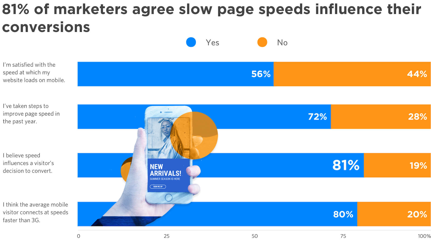
We wanted to know where improving page speed was falling in the marketers’ yearly priority lists—as well as what their customers experience (and how they behave) when a website is slow to load.
This research stirred up all kinds of reasons why you definitely need to keep speed in mind when creating landing pages. For instance, Google says 53% of visitors will bounce after three seconds of waiting. But our check-in at the Call to Action Conference in late 2018 revealed that 85% of participants’ pages came in slower than 5 seconds at a 3G connection. (We’re not naming names, but some took more than 20 seconds.)
The survey results also revealed that consumers are pretty frank about the impact that slow ecomm sites can have on their willingness to buy:
What surprised us most, however, is that improving load times remains an overlooked way of optimizing the visitor experience. Very few marketers we surveyed identified it as a priority for the year, even though those who did have likely seen the benefits.
What Marketers Can Do in 2020
The thing is, these page speed concerns aren’t going away.
The average time for a web page to load is actually slower at the end of 2019 than it was a year ago. Some marketers have resisted making big improvements to loading times in the hopes that technology will save them (“5G is coming any day now!”). But speed remains a competitive differentiator.
Google hasn’t backed away from forcing the issue, either. They’ve always said that speed matters, but in November, they outlined plans to indicate when a site has been historically slow to load using badges in Chrome: “We think the web can do better and want to help users understand when a site may load slowly, while rewarding sites delivering fast experiences.”
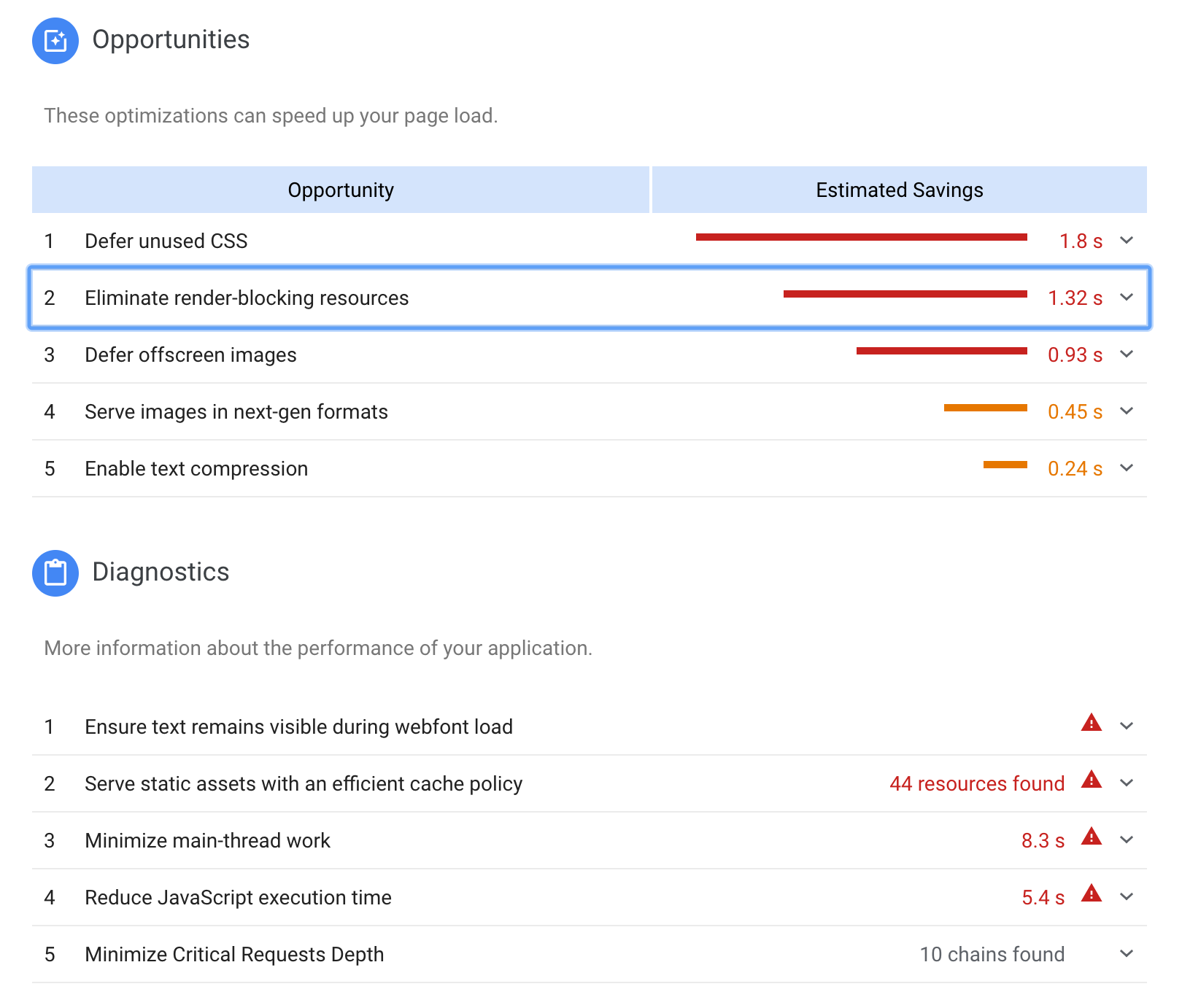
All of this adds up to a continued need to boost speed on your landing pages and website. To help, Unbounce’s Garrett Hughes put together a shortlist of page speed fixes (plus a downloadable checklist). And if you want to achieve blazing speeds on mobile devices, you’ll also want to investigate using Accelerated Mobile Pages (AMP) as well.
About Unbounce Speed Boost. We’ve made backend improvements to the landing page builder to ensure that, under the hood, every landing page you create is designed to follow Google’s best practices for performance. So you don’t have to think about it. You can read about these improvements here.
Lesson 2: A/B testing isn’t your only optimization option.
At Unbounce, we’ve been preaching the gospel of A/B testing for a very long time. (For as long as there’s been an Unbounce, as a matter of fact.)
Here’s a snippet from our very first website, ten years ago: “With built-in A/B testing as a standard feature, you can experiment with unlimited variants of your page until you achieve the optimal design.”
In those days, we saw the promise of a “no-nerd approach to landing page construction” that included “a digital dashboard to rival the Starship Enterprise.” (No-nerd? Riiight.)
Unbounce.com circa 2010
Today, A/B testing remains an incredible way of testing an informed hypothesis about your landing page. For many people, though, the number of visitors you need (and the time necessary) can put it too far out of reach. No wonder while 98% of marketers recognize testing has definite value for their business, 42% say it’s too difficult for them.
But optimizing and A/B testing aren’t the same thing. And smaller teams and businesses that don’t get the critical mass of traffic to test efficiently should still make optimizing part of business as usual.
What Marketers Can Do in 2020
Nobody would blame you for taking a one-and-done approach. If you find yourself in the camp of marketers who’ve struggled to A/B test in the past, the good news is that the times are a-changin’. New pathways to optimizing your landing pages are opening up as you read this.
In November, we made Smart Traffic available to Unbounce customers. Powered by machine learning, this tool dynamically sends each and every visitor to a page variant that’s right for them. Plus, while running A/B tests requires tons of traffic, Smart Traffic starts optimizing after as few as 50 visits.
It’s not only extremely rad, it’s also bone simple: build some variants, set a conversion goal, and turn it on. I encourage you to try it out for yourself.
Beyond Smart Traffic, it’s almost guaranteed that machine learning (from us, from elsewhere) will continue to reshape your marketing stack and enhance your marketing practice. In 2020, you can expect more options when it comes to optimization, personalization, and automation.
The takeaway: adopting a growth mindset means making optimization an everyday practice. Thanks to new technologies, the barriers are beginning to topple—so keep an eye out for opportunities.
Machine learning will free us from the grind, allowing us to do more of what humans do best. But this also means that it’s more pressure than ever to become the best darned human marketers we can be.
It’s time to raise our marketing IQ. That means moving beyond best practices, received wisdom, and going with your gut. It means making smarter, more informed decisions based on a highly developed skillset. And it means optimizing yourself as a marketer, not just your landing pages.
We think it’s incredibly important, which is why raising your marketing IQ was the theme of this year’s Call to Action Conference.
Over three days, we sought to bring marketers and industry leaders together to talk and sharpen our skills in six vital categories: design, copy, analytics, process, emotion, and strategy (which ties ’em all together).
Unbounce Co-Founder Oli Gardner summed up the benefits of high IQ marketing in a blog post earlier this year: “This is marketing that takes things to a new level, going past surface-level findings to understand the true value of your generated leads.”
Oli Gardner at CTA 2019
What Marketers Can Do About It in 2020
In 2020, BYOTL (be your own thought leader). Keep devouring blog posts and other content from the experts, sure, but look for those sources that challenge the status quo and go beyond the best practices. (If you’re looking for some blog recommendations, I think this list from The Search Agency is a pretty good place to start.)
Finally, if you weren’t able to join us at CTAConf in 2019, you can also get caught up on all 20 speakers, watch videos, and review slide decks on our recap site. This includes experts like Joanna Wiebe, Larry Kim, Ross Simmonds, Nadya Khoja, Jason Miller, and Andy Crestodina—as well as a few surprising perspectives on marketing today.
(Finally, binge-watching you can feel good about.)
This lesson became immediately apparent when people began to take notice of a single illustration trend that dominated SaaS branding in 2019.
As Unbounce’s Luke Bailey wrote in a post back in August, “Depending on who you ask, these drawings and animations are either fun and whimsical, or strange and faceless. Maybe you see them as friendly-looking doodles … or maybe you see them as just plain weird.”
It was the sheer ubiquity of these “little buddies” in 2019—especially given the time and thought that SaaS marketers put into standing out from the crowd—that’s particularly striking.
Jimmy Daly, Marketing Director at Animalz, first called out how common the style was becoming:
i genuinely respect all of these companies and use these tools but saas websites are perpetually homogenous. what gives?
Like many of us, Daly doesn’t necessarily dislike this trend, but he isn’t sure how these illustrations were suddenly everywhere. In his words, what gives? Should SaaS brands even care about achieving originality? And if not, where should there focus lie?
Given the enormous pressure to carve out an identity that’s distinct from competitors, marketers might be tempted to try to avoid all influence from others in their space. Even if this were possible, though, it probably isn’t the best approach. Wildly different branding isn’t necessarily what your customers want from you.
Instead, Luke advises taking a more thoughtful approach to your SaaS rebrand:
If you’re planning to launch a new version of your website in 2020, there’s nothing wrong with looking to other companies you admire for inspiration. But, at the same time, you’d be doing your own brand a disservice if you just try to straight-up swipe someone else’s style.
Luke Bailey, Unbounce Content Team
Luke says to consider your product, your place in the market, your target audience, and your brand personality before jumping on any design trend. Striving for some originality makes sense, sure. But matching your brand with your audience is more important.
Whether the cycle of SaaS rebrands in 2020 brings us more of these little buddies or something a little more out there (“What if our new website was, like, entirely turnip-based?”), it makes sense to keep your eyes on the prize: converting visitors into customers.
The lessons you’ve learned from 2019 don’t stop being relevant at 11:59pm on December 31st. It turns out that the earth orbits the sun all the time, and we’re just marking the time.
So how will what you learned in 2019 transform how you do your job in 2020? What are your own marketing lessons going into the new year? What are your marketing resolutions? Now’s the time to start thinking…
We’d love to hear your answers in the comments below.
It’s a vicious cycle that many SaaS marketers fall into—you’re trying to hit your lead-gen targets, but your budget and resources are tight. So you turn to a quick, one-off campaign to generate some leads.
Then, once that campaign runs its course, you start planning the next one.
And so on. (And so on.)
While this cycle can be effective in the short term, it’s just not sustainable. Running campaigns in this way create spikes in traffic that can quickly die out if you don’t invest in ongoing promotion. They also take a lot of effort to execute (and don’t guarantee returns).
Cue the infomercial voiceover: “There has to be a better way!”
Pictured: A typical SaaS marketer workin’ the lead-gen funnel.
Turns out, there is a better way.
If instead, you invest some time developing ‘always-on’ campaigns, you can drive consistent growth in a much more efficient, scalable way. For instance, if you have core assets (like a webinar, newsletter, or demo page) that you routinely drive prospects to, you can make these work year-round by creating some landing pages that run on auto-pilot.
There are tons of evergreen landing page campaign possibilities, but we’ve rounded up five that we think every SaaS marketer should have in their arsenal. Keep these ones running 24/7/365 for steady lead generation all year long.
1. The “We Solve Your Problem” Long-Form Landing Page
Do your prospects tend to do a lot of research before they start a new trial or demo your product?
This is where an evergreen, long-form landing page shines. Evaluation-stage prospects are hungry for details, proof of results, examples, and info tailored to their experience. They need to be persuaded to choose your offering over the alternatives.
So, for paid search ads targeting transactional keywords, you may want to create a standard SaaS long-form landing page explaining your offer.
Like this one:
Image courtesy of Pitchbook. Click it to see the whole thing.
The SaaS sales page above from Pitchbook has a preview video, a customer testimonial, and a logo bar of social proof to build credibility. It does a great job giving visitors a comprehensive rundown of the product’s features and benefits. All in support of that awesome ‘request a free trial’ call to action.
Why should you build one?
Long-form landing pages help your audience make more informed decisions by providing in-depth information about your software. With more sections on the page, you have room to expand about what sets your offering apart from competitors and the value you deliver.
As a bonus, these pages aren’t just effective for middle-of-the-funnel prospects. They can also help folks at earlier stages of awareness. For instance, people in the discovery stage may not know they have a problem, but they’re likely experiencing the symptoms. The extra length lets you conduct a thorough investigation and lead visitors down the path from the symptoms to the problem to (hopefully, your) solution.
With a long-form landing page that runs 24/7/365, you can show potential customers how their current situation is costing them money, time, resources—or any other problem you’ve helped them identify. You can also anticipate the objections your target customer might have about your software and address them with compelling, long-form storytelling.
2. The “Weekly How To” Webinar Landing Page
You can raise awareness of your webinar through your email and social media channels, and you’ll definitely see some engagement for your effort. (After all, how hard is it to click a little icon?) But without a dedicated landing page, it can be tough as old leather to convert interested people into actual registrants.
It’s easy to forget that once you finalize your content and secure your speakers, you still have to convince your visitors to register to attend.
This webinar landing page that Thinkific built with Unbounce gets it right:
Image courtesy of Thinkific. Click it to see the whole thing.
Promoting an entire digital summit, this page has a large, eye-catching header section that tells the viewer exactly what they’re going to get out of this online event. It also has strong calls-to-action placed above the fold and below the body copy, plus detailed descriptions of the speakers.
Thinkific even includes an FAQ section to help potential registrants get as much information as possible before they make the decision to sign up.
Why build your own webinar page?
If you’re asking prospects to give you their email details and an hour or more of their time, you need to make it clear what they’re getting in return. With a landing page, you can communicate the value of registering for an online or offline event using persuasive elements like benefit-oriented headlines, social proof, and testimonials.
You can also use these pages as an entry point for visitors to explore other relevant content. For example, the bottom of the Thinkific webinar landing page features a short value statement that highlights the benefits of their product in a call-to-action to start a free trial.
Let’s face it: the traditional lead magnet is losing its pull. Years ago, you could offer a simple downloadable piece of content like an ebook or a PDF resource and watch your conversions soar.
Today, it’s often a different story. Fewer visitors are willing to part with their email addresses—and if they are, you better have something truly valuable to offer in exchange. To address this, SaaS businesses are upping their lead magnet game by trying out quizzes and other types of personalized, interactive, or tool-based marketing elements.
Here at Unbounce, for example, we developed a free analyzer tool that offers insights on how you can optimize your landing pages:
While an ebook or downloadable PDF can also help to educate visitors, what happens once they finish with that static piece of content? It’s up to each individual to figure out how to apply the learnings, and they’re not always motivated to follow through. That means it’s often the end of the road. They close the book, and they’re done. That’s not great for engagement.
People also have to set aside some time to actually read through your material. In comparison, a quick tool like the analyzer provides each visitor with a personalized report on their specific pages—instantly. No pain, all gain.
And we serve this tool up on an Unbounce-built landing page that converts almost 30% of all visitors. It’s a great way to offer value, all the while serving as an evergreen awareness campaign that’s directly plugged into what we do.
Why should you consider a tool on a landing page like this?
Calculators, quizzes, and other tools are a great way to inject a little fun and—ideally—high value into your lead-gen or awareness strategy. They empower your visitors with insights on their specific situation. And they give you more info about your audience than you could get from a piece of static content.
Interactive lead magnets can also reduce the time your business spends on sales queries and save you time by automatically sending someone’s contact information through your funnel via integrations with your CRM or email marketing platform.
Finally, an interactive lead magnet can help instill loyalty in your visitors. If you’ve helped someone solve a problem, they’re much more likely to bookmark your page and remember you for next time. Plus, you get more credibility because you’ve proven that you know your stuff and understand your audience’s needs
4. The “Newsletter Audience-Builder” Landing Page
These days, you’d be hard-pressed to find a company without an email newsletter. It’s one of the most efficient, cost-effective ways to stay top-of-mind with your audience.
But people also find these newsletters increasingly easy to ignore, easy to tag as spam, and easy to unsubscribe from. That’s why it’s imperative that you keep your list fresh by adding new subscribers.
It’s easier than ever for someone to unsubscribe from your newsletter. (Source: AndroidPolice)
Sure, you can put a newsletter sign-up button on your website and call it a day. But if you really want to grow your mailing list, you should consider adding a dedicated landing page into the mix. With a landing page, you can experiment with copy and compelling visuals to ensure your newsletter’s differentiating value really comes across.
For instance, Pitchbook’s newsletter sign-up (which is another hit landing page from their team) checks all the boxes. It has a clear headline, uses visuals to show what the newsletter looks like in different formats, and has a short-but-sweet form:
Image courtesy of Pitchbook.
If you prefer to keep things simple, though, you could follow this example from Later. There’s not a lot of text on this page, but each piece of copy serves a purpose. The headline (“Never miss an Instagram trend again”) drives home the key benefit of signing up for their newsletter. And the subheading acts as social proof. (After all, a million-marketer-strong email list is nothing to scoff at.)
Image courtesy of Later.
The last section sets expectations around frequency, so potential subscribers can feel confident knowing Later won’t spam their inbox with multiple messages a week. And by only asking for an email, they make signing up even more enticing to their audience of marketers (who are usually wary about giving up their personal info, but often do so when it’s in exchange for more data).
5. The “Sign Up For a 1:1 Demo” Landing Page
While you can give your website visitors a small taste of what you offer through videos and webinars, this often can’t compare to leading someone through your product personally—where your guest can ask questions live. This is why offering a free demo is a common step in the SaaS buyer journey and a key landing page you’ll want to have available evergreen.
Visitors at this stage can be pretty close to making a purchasing decision, so your number one priority should be to make this process as frictionless as possible. Fortunately, a landing page is one of the easiest ways to do this:
Image courtesy of Skillshare.
The most effective demo landing pages are pretty straightforward. They typically have a clean and simple look, a form, a phone number field for an alternative form of contact, social proof, a video, bullet points, or another short message that outlines what users can expect from the demo.
While the “request a demo page” from Skillshare above is missing some social proof in the form of testimonials, all the other important elements are present. It’s easy to follow and the lead-gen form is a reasonable length to help the Skillshare team understand how to tailor the demo.
Conversion tip. You can take things a step further for your always-on demo landing pages by adding a pop-up. For example, you could use this calendar notification pop-up template and have it appear after someone converts. This would prompt your visitor to add a calendar reminder to join the session and ensure your live demo attendance is high.
Evergreen Your SaaS Landing Pages
If you set up these evergreen landing pages as a first step, you can generate a ton of leads for your software without developing campaigns on a typical one-by-one cadence.
As with any other type of campaign though, it’s a great idea to optimize these pages to ensure you’re getting the best results possible. Experiment with on-page elements, the copy on the page, or adding social proof. Even tiny tweaks can have a big impact.
The work of a SaaS marketer is never done, but by building pages for the long term you can create conditions that help you generate leads and conversions—without climbing on the campaign hamster wheel.
The agency life ain’t easy. There’s constant competition to acquire new clients and new agencies are poppin’ up every day.
You know your agency delivers and that your team is stacked with experts. You know your clients will be happy they chose you because you’ve got a great track record. But, you also know every agency out there is saying the exact. same. thing.
It helps to have something extra in your proverbial utility belt—something to offer outside your stellar services that sets your agency apart. Something like The Unbounce Partner Program, which gives you several of those somethings. In fact, you may need a bigger belt. And a bigger wallet.
A referral program designed for agencies and marketers, the just-launched Unbounce Partner Program gives you 20% of the monthly recurring revenue (or 25% of the total annual revenue) for every client you help discover Unbounce. It was inspired by those who’ve been referring Unbounce unofficially for years—and who we wanted to give thanks to on top of the returns that were naturally occurring.
Agencies teaming up with Unbounce, in particular, have seen advantages over their competitors in two ways.
First, by creating landing pages for their clients that get higher conversion rates time and time again. Customized landing pages are a proven way to improve the performance of paid advertising, email, and lead generation campaigns. The results speak for themselves, clients listen, and more often than not, the agency that provided all that R for their I becomes the go-to choice for future services.
“Once [clients] hear that we can go out and buy the same clicks anyone else can, there’s nothing proprietary about that, but we can leverage the PPC experience with landing page testing….That’s when clients start to understand ‘OK, this is a company worth working with’. If only for that differentiator.” – Andrew Miller, Co-Founder of Workshop Digital
And second, agencies add to the power of their own expertise by combining it with ours. We’ve been toiling away in the marketing industry for ten human years, 70 dog years, or approximately 378 marketing years (we all know how fast that shizz moves) and have become the top choice for conversion platforms by doing our homework and testing for what works.
We back you with the tools to pull off the results your clients will get excited about, as well as tons of learning resources to stay ahead of the game. Whether it’s demystifying GDPR, choosing Accelerated Mobile Pages, explaining the wild world of Google’s rules, or figuring out makes a page as optimized as possible, we’ve got you covered.
Becoming an Unbounce Partner is a way to underline these benefits, weave in a couple more, and add to your cash flow on top of it all. Without further ado, here are some of the ways you can use the Unbounce Partner Program to grow your agency and make your clients really, really happy.
Offer Landing Page Services with Inarguable ROI
It’s no small potatoes to put your word behind a product—putting yours behind Unbounce means making a promise to your clients that it’ll help their business. At over 500 million conversions clocked in by our customers, you can rest assured that promise will be kept.
“In some cases, we saw conversion increases of over 70%, just by switching a client’s landing page over to Unbounce. Because Unbounce allows us to test and iterate more rapidly, we’re able to increase our speed of testing which is a win for everyone involved.” – Nicholas Scalice, Founder of Earnworthy and Unbounce Partner
And, it’s easy to start offering these services. Any member of your team can create slick, on-brand landing pages, popups, and sticky bars using drag-and-drop functionality and a huge variety of templates that can be customized to your (client’s) heart’s content. Under the hood, you’ve got Unbounce Speed Boost for fast-loading pages on desktop and mobile, super-granular audience targeting, dynamic text replacement, and more features that create a better and higher-converting visitor experience.
In other words, we make sure your word delivers.
Easy Campaign Management (for all) and Ongoing Profit (for You)
Multiple client sub-accounts have always made for easy campaign organization and collaboration. Before the Partner Program was born, agencies using Unbounce would typically add clients into their own account. As an Unbounce Partner, a simple switcheroo—giving your clients their own accounts and having your team members added as users in theirs—allows for the same campaign management and collaborative freedom while bringing in that sweet, sweet referral cash to boot.
“We’ve been using an agency account for years, often charging clients a usage fee to use our agency account. The Partner Program is great because it gets clients to use their own accounts that earn us a referral fee, which can really add up over time. And our commissions increase if they opt into larger packages.” – Patrick Schrodt, Founder of Titan PPC and Unbounce Partner
If you and your client end up going separate ways, a silver lining remains in the form of lifetime Partner Program earnings. As long as they remain an Unbounce customer, you keep getting paid.
Discounts Your Clients Will Love
Who doesn’t love getting something awesome for less money? Joining the Partner Program gives you access to exclusive discounts you can pay forward to your clients. Discounts they literally can’t get anywhere else (and by literally, we mean literally).
Every client you refer to Unbounce gets 20% off their first three paid months on top of the 30-day free trial. Or, 25% in total off of an annual plan if that’s more their speed. Between your agency’s super team growing their business and serious savings on Unbounce’s conversion power, you’ll be primed for a good ol’ fashioned money fight. We all know that’s what you really do in those pitch meetings.
“We typically see a 2-3x increase in conversion rates with Unbounce. I can’t imagine building a client’s account without Unbounce these days. Especially for anything lead gen. Titan has been growing year over year and a lot of that has to do with client retention. These clients are sticking around because they are converting like mad.”
– Patrick Schrodt, Founder of Titan PPC and Unbounce Partner
Brand Alignment and Promo Power
When two rights come together, they can make a damn right. You’ve got a killer team who knows their stuff and a portfolio to prove it. And as mentioned above, Unbounce has a decade of experience in conversion marketing and pudding full of proof that our product works. An official partnership is an instant way to bolster the reputation you’ve worked hard to earn, and strengthen the relationships with your clients over time as you continue to give them results worth celebrating.
As a Partner, you’ll also get co-branded sales enablement materials and templates that will highlight your agency as you promote your partnership to bring in that extra revenue. It’s a partnership, after all—we’re determined to get you as much out of it as we can.
Anywhere between 12-27%. That’s two to five times the median.
If you’re reading this, chances are that you’re stuck somewhere in the depressingly-low single digits. Most are.
You’ve got the right keywords, your Ad Groups are on point, and your landing pages nail the essentials. So why are conversions and costs not budging?
The problem is that while ‘best practices’ can be helpful, they’re not enough. You need to rethink howthose PPC landing pages are organized, whothey’re targeting, and what customers need from them at different points in time.
Here are three places to get you started moving up into that double-digit club where you belong.
1. Funnel Segmentation
PPC landing pages arguably have the biggest impact on campaign ROI—just not for the reasons you think. It isn’t just the cheesy, tool-generated headlines that are stopping you from converting. It’s the lack of funnel segmentation in your campaigns.
In a perfect world, your PPC campaigns look like this:
Multiple stages of your funnel
+ Multiple offers for each stage of the funnel
+ Multiple keyword variations + ads for each offer
= Dozens and dozens of landing pages
And yet, you probably don’t have dozens and dozens of landing pages. You’re probably rocking one landing page. Potentially five. Rarely, ten.
Because: work. I get it.
But you don’t need another lecture about TOFU, MOFU, and BOFU. You need to start differentiating campaign offers with pages for each one.
Check out Jon Loomer’s 15 Facebook ad campaigns, for instance. He’s got awareness-based content campaigns at the top, lead gen nurturing ones in the middle, and revenue-producing sales offers at the bottom. Each with a different offer and associated landing page:
Loomer’s 15 campaigns cover the whole funnel (image via Jon Loomer)
He’s even got different offers for different segments in the same funnel stage. Beginners get one page, while power users get another. This is an excellent example of how it should work, but where do you start?
How Directive Consulting built a funnel
Here’s a common way this plays out. Brady Cramm, Director of PPC at Directive Consulting, had trouble driving results from LinkedIn display ads at first. That’s because up until recently, LinkedIn’s advertising options were a nightmare.
Targeting was a significant part of this problem. LinkedIn tempts advertisers to laser-target an audience based on job title or role. But the audience sizes often weren’t large enough based on the poor click-through rates. As a result, it used to be brain surgery to manifest a few clicks a day. And your chances at turning those into any meaningful lead count was minuscule.
Thankfully, there’s been significant improvements since then.
Brady now uses LinkedIn ads to drive eBook downloads and views. But they’re beginning to move away from gated content in favor of tracking pixels on different pages.
For example, you can drop the LinkedIn Insights Pixel on your site. You don’t even have to be running ads to use it:
The Pixel can be targeted towards specific pages, like your guide, eBook landing page, or ad offer. Once you get over 300 visitors to that page, you can tap into their matched audiences.
As Brady points out, “you can see what job titles, industries, and functions are on each page. You can see that you’re getting VPs of marketing and then create a tailored campaign specifically for them.”
And that’s the killer targeting he now looks for:
LinkedIn Insights Pixel demographics lets you figure out who’s visiting. (image source)
Here’s an example of how it all comes together. Brady’s company, Directive, has a popular post about B2B marketing ideas. They rank high on the popular search query. And as a result, they net a ton of traffic.
The LinkedIn Insight Pixel here helps them figure out exactly who’s visiting (and why).
Then they can turn around and create a Facebook lookalike audience based on the people who’ve visited that page from search:
It doesn’t stop there. Once someone becomes a lead or provides their information, custom audiences can be spun up on both on LinkedIn with Matched Audiences…
But Brady’s strategy doesn’t stop there. “There are a lot of PPC opportunities outside Google Ads,” he says.
For instance, Directive also uses Quora ads to promote an opt-in eBook. The book’s topic dealt with “B2B marketing demand gen,” so he targeted “B2B demand gen” topics in Quora. Makes sense. (And the Quora listing is written like content, so it blends in and gets a better response rate.)
Third-party directories are also huge for B2B.
Think about the typical customer journey for a second. The very first step is for someone to realize they have a problem. When that happens, they start looking for information around that particular issue. After gathering enough research and evidence, the next step is to begin transitioning into potential solutions.
Most competitive markets have different affiliate-based sites that aggregate, rank, and suggest possible solutions. Local businesses have Yelp. Travel has TripAdvisor.
And B2B has Capterra.
Capterra lists companies within specific verticals, like “construction marketing software.” Options are then ranked based on a number of criteria, like the number or quality of reviews.
But you can also pay to be listed at the top too. It’s a PPC bidding war. Potential customers look up related software alternatives, and you pay to be listed in the top five to get the most interest:
Brady elaborates on the benefits of using Capterra:
“I see those as highest Sales Qualified Leads (SQLs) at lowest costs. In consumer’s eyes, they see our client ranking as top three [blank] software company. And then from there, you can audit the competition’s landing pages, improving the messaging and CTAs to outperform them.”
Managing ad spend across campaigns
Beyond this basic setup, Directive uses Shape.io to manage budget and ad spend across many different concurrent campaigns in places like Google, LinkedIn, Facebook, or Capterra: They work with a lot of large accounts that frequently start and stop campaigns based on iterative performance. That can be a managerial nightmare. It’s incredibly time-consuming to babysit campaign performance to the required level of granularity. And the risk of missing something and overspending is high.
Shape lets Directive set up predefined targets with caps for multiple campaigns under each client that make it tailor-made for scaling agency accounts. Brady agrees:
They offer a cool, all-in-one visualization of all channels. It includes budget trend, predicted spend based on real-time performance, how increases or decreases will affect performance, and also an autopilot feature to catch trend lines to not overspend.
2. Message Match
Now, if you’re following Jon Loomer or Directive Consulting’s example, you’ve got funnel segmentation. You’re treating landing pages like content mapping, aligning unique pages with each different offer, segment, or audience, within each stage. You have SKAGS or other tightly-controlled ad groups.
The next step is to align messaging for each page to (1) who’s visiting, (2) why they’re visiting, or (3) where they’re visiting from. Why?
That’s where Dynamic Text Replacement comes into play, a handy little off-the-shelf feature in the Unbounce Builder to help you personalize PPC landing page content. It’d be challenging to do this hundreds or even thousands of times, but dynamic text replacement solves this (almost) overnight.
Dynamic Text Replacement (DTR)
Inside the Unbounce Builder, you can highlight a content section, like the headline. Head over to the “Properties” tab, and click on “Dynamic Text Replacement.”
Next, you can set the parameter and default text to show visitors as a backup plan. It’s all pretty straightforward.
And we’re still just scratching the surface here.
ShipBob is making a killing by optimizing message match across all campaigns. Chief Marketing Officer, Casey Armstrong, reported that they’ve been able to scale their ad spend over 60% quarter-over-quarter while keeping ROI the same:
At ShipBob, we hyper-focus on customization from ad to landing page to on-boarding experience. We’re launching some exciting new on-boarding elements shortly, so today we can focus on the ad-to-landing page experience. We use Unbounce and run a script to create dynamic header and copy changes throughout the page. We mirror our ad campaigns and ad groups to each landing page, as we run over 1,000 campaigns and over 100,000 groups.
So, for example, you Google “Shopify Order Fulfillment” and see this exact-match ad:
You click it, and then land on a page that exclusively focuses on “Shopify order fulfillment”:
Google Ads IF functions are another game changer for message match because now you can pair it with DTR to customize ad and page, automatically.
For example, you can use RLSA audiences or even device type to customize ad text on the fly, even going so far as to change the offer for each. Take this example from Samantha Drane of CPC Strategy:
The way we use our mobile device is different than the way we search on desktop. Mobile is more ‘in the moment’–maybe you’re going somewhere or looking for something near you, but desktop is considered more of a research tool.
Here’s how it works out:
Targeted Templates
You can create page templates for each segment, too. So that in addition to copy, other page elements can be customized, like an attorney-looking dude that pops up when you search for “attorneys”:
While a doctor-looking dude comes up for “doctors”:
(Note: These examples are both dudes because the targeting was primarily dude-specific.)
In fact, laser-targeting each landing page like this to every single keyword you’re bidding on might be the lowest-of-low-hanging-PPC fruit. Obsessive message match in this last example decreased cost per converted click from $482.41 to $147.65 while increasing the conversion rate from 4.08% to 12.76%.
Before:
After:
Multiply those cost changes against a $30,000/month budget (which this was), and you’re talking about hundreds of more leads for tens of thousands less.
3. Offer Messaging
Google Ads can trick you.
Nowhere else can you get sales-ready leads with such precision and accuracy. No other platform—online or off—delivers people to your door with wallet in hand.
That’s why the same old boring “Free Quote” landing page works OK on Google Ads but absolutely bombs on pretty much every other channel out there. Don’t fall for that trap.
The final ingredient separating double-digit landing pages from sub 1-2% is amplifying the offers you’re using to draw people near (three billion in ad spend analyzed can’t be wrong.)
It’s about moving away from a direct hard sale:
To one that focuses on the end result that your customers receive:
Except, how do you balance message match (who they are, where they’re coming from, etc.) with more persuasive copy that gets them to convert?
Luckily, Joanna Wiebe’s got the trick to balancing the two with her 10/90 messaging hierarchy layout:
10% message matching, 90% convincing (image via Copy Hackers)
Customize the top ten percent for message match, and the bottom 90 percent for persuasion.
When you’re trying to be persuasive, it’s easy to forget that you still need to be as concise as possible. The Conversion Benchmark Report states that pages with fewer words (less than 100) convert 50% better.
So how can you possibly persuade, while ruthlessly cutting word count?
Wistia recommends split testing with video placements: “Put your video to the test by making two different versions of the page and seeing which one drives more conversions, the one with or without the video,” according to Venngage’s guide on lead gen. Then you can even split test different types of videos or demos.
Split testing pages, not necessarily A/B testing, is a recurring theme. For instance, you can split test different types of offers for the same campaign. No matter if it’s a quote request, free assessment, webinar, or interactive calculator, like the one we created for Podia:
For Directive Consulting, on the other hand, software demo videos work really. They’ll often do on-demand or evergreen ones (as opposed to scheduled ones), so prospects can view the video at their own convenience. Here’s a perfect example:
Extras like this help a lot in a competitive environment, like Google Ads or Capterra, where the same person might click on the first ten companies to compare them all within a few minutes.
“Convenience can provide a big lift,” says Brady.
Brady focuses next on ad copy, but not just for message match in this case. Page elements, like teaser bullets, quickly summarize the main outcomes and benefits (not features) a prospect might get.
This is also one of the most common mistakes he sees on most B2B landing pages.
It’s so important to get that outside perspective. There’s a poison in many B2B companies, where everyone uses their own language around the office. They all understand it. But nobody (outside of the company) knows what they’re saying when they bring it to the web.
So not this:
But that:
Device targeting
Last but not least, device targeting can make or break your campaign’s offer messaging.
Landing pages need to be treated differently if they’re on mobile versus desktop. One time, a Directive client had their form below the fold on mobile devices. The page was responsive, but the mobile layout wasn’t ideal, forcing the form out of sight and out of mind:
The solution was obvious: “We swapped [the form] to the top and conversions went through the roof.”
And Brady also decided to segment paid campaigns only for mobile or desktop. Not both: “Mobile traffic was sharing and clicking, which is good. But they weren’t staying very long, consuming it, or opting-in.”
Users exhibit different behavior on mobile versus desktop. Brand awareness campaigns or content promotion might work well on social, but lead gen campaigns are often better reserved for desktop. We’ve confirmed this across several promoted content tests on Facebook.
My company spent $984.69 on one content campaign and found that the three primarily-mobile placements (Audience Network, Messenger, and Instagram) significantly outperformed desktop and right column placements for top-of-the-funnel traffic.
In this case, it makes no sense to continue spending anything on desktop placements. You might as well drive as many cheap clicks as possible, so you can later retarget them with better offers on desktop when there’s a better chance they’ll convert.
Here’s how the math breaks down after shifting more ad budget to the mobile-based placements:
That’s nearly 2,000% more clicks for the same spend. And we were able to repeat this trend again and again and again.
So the campaign success wasn’t just indicative of a single headline or button or any other variable on your PPC landing pages.
Rather, we learned that campaign success more often comes from aligning everything from the funnel segmentation, with message match, and offer messaging across each placement.
Conclusion
Button color has basically zero impact on your PPC campaign performance. Yes, landing pages should have certain elements. Yes, they should be convincing and professional.
But what separates a >10%+ converting landing pages from a <2% one isn’t just what’s on the page.
It has to do with your funnel segmentation and how you’re delivering offers to people on different platforms and different times.
It has to do with message match at scale so that each combination of ad and landing page aligns perfectly.
And it has to do with how you’re testing page offers to better match what people want.
So while ‘best practices’ are a good starting place, true landing page success doesn’t come down to any single variable but how all of these puzzle pieces fit together in the end.
To find out, we polled almost 400 marketers on their attitudes around page speed and asked what (if anything) they were doing to get faster.
Just 56% of marketers are happy with their mobile load times, according to the 2019 Page Speed Report.
Almost three of every four respondents said they had taken steps to improve their page speeds over the last year, and that’s pretty good. Alarmingly, though, only half of marketers we surveyed are satisfied with their load times on mobile.
So most marketers are trying to get faster, but many aren’t where they want to be. Which begs the question: what are people doing to speed up their landing page load times?
Computer, enhance!
Only 39% of marketers have bothered to find out how fast their pages are actually loading. Not great.
Here, we start to see why marketers are somewhat pessimistic about their page speed progress. Just over half have optimized their landing page images—ostensibly one of the simplest ways to speed up your load times—and even fewer have done any of the real technical-sounding things they need to get faster. (I mean, fair, they sound pretty boring to us, too.)
Here’s a doozy, though: just one in three marketers have run a website speed test to find out whether their load times are impacting their conversions. That’s the easiest one!
And hey, we get it. Marketers are being asked to do more than ever before, often with fewer resources. If you’re a small team (or a single person, the smallest of the teams), you might feel you don’t have the time or expertise to meaningfully improve your page speed.
But I’ve gone and done the hard work for you—me, a film school graduate who, until recently, believed that his Apple computer was impervious to viruses. (Hoo boy, it is not.) I’ve spent hours talking to Unbounce developers, reading how-to guides, and generally just bombarding my brain with the most dull, technical page speed information I could get ahold of. (Apologies to said developers.) And if I can get my head around it, there’s no excuse for the rest of you.
Below, I’ve simplified some of the most effective ways to increase your landing page loading times in a guide. For each fix, I’ve indicated the technical difficulty and the estimated time it’ll take, so you know exactly what you’re getting yourself in to. Use the table of contents below to jump to what’s relevant to you, or go ahead and do it all in order.
Get Unbounce’s landing page speed checklist and follow our step-by-step guide to improve your load times in a single afternoon.
Final note: If you’ve built your page with Unbounce, you can skip a lot of this stuff—we make many speed fixes on the back-end automatically. In this post, look for the ‘Building Pages in Unbounce?‘ callout boxes to see if a given fix is something you need to implement.
Before you throw on your hard hat and start hitting things with a hammer (both figuratively and literally), it’s important to have some idea of what’s working—and what’s not—on your landing page. That means running a speed audit.
It’s important to point out that, regardless of which speed test you use, you don’t want to get too hung up on your score. Achieving a perfect score is not always technically possible (and it might not even be desirable). Instead, use your results as a general guideline to improve page speed and implement the fixes that make sense for you.
Okay—let’s test them pages.
Run a Google Speed Test
Difficulty: Easy / Estimated Time: 5 Minutes
There are a bunch of great tools for testing your page speed, but why not start with the big dog itself? Google’s PageSpeed Insights is an awesome way to do a quick performance check-up with at-a-glance recommendations. (Ryan Engley, Unbounce’s VP of Product Marketing, explains how to interpret and act on your PageSpeed Insights results in this must-read blog post.) Then there’s Lighthouse, a newer tool from Google that provides a comprehensive analysis of your how your page presents to end users.
You’ll also want to run your page through Google’s Test My Site tool, which will check your speed from a mobile perspective.
Clicking on individual results in PageSpeed Insights will reveal your problematic page elements.
Running a Google speed test should only take a couple of minutes, and the results will help you identify some of the top opportunities to boost your landing page load times.
Try the Unbounce Landing Page Analyzer
Difficulty: Easy / Estimated Time: 5 Minutes
Running a speed test with Google should be your top priority, but PageSpeed Insights doesn’t give results tailored to landing pages. For that, you’ll want to run your page through the Unbounce Landing Page Analyzer, which not only provides feedback on page performance but includes a bunch of advice on creating more effective campaigns and kicking your conversions into overdrive.
Unbounce’s Landing Page Analyzer provides feedback on page speed, but also actionable advice on things like SEO, message match, and mobile-friendliness. Building Pages in Unbounce? Then you’ll definitely want to give our Landing Page Analyzer a shot. Get best-practice recommendations for conversion optimization and see how your landing pages stack up against others in your industry.
Improve Your Landing Page Speed: Easy Fixes
With your results from both Google and Unbounce, you’ll be well-equipped to move onto the actual work of making your page perform better. It’s time to pick up that hammer.
These fixes should be simple enough for anyone to tackle, regardless of their technical expertise.
Reduce Your Page Content
Difficulty: Easy / Estimated Time: 15 Minutes
We’ve marked this as an easy opportunity to increase your page speed, but it probably won’t feel like that when you start thinking about which elements on your page you can junk. Marketers love big hero shots, beautiful supporting imagery, and fun, animated explainer videos. But how much of that content is actually helping you drive conversions?
Visual content accounts for a huge portion of the size of an average web page—images account for over 20% of web page weight, as pointed out by Kinsta—and each element creates an HTTP request. That’s when your visitor’s browser pings your web server to request the files that make up the elements of your page. Too many calls can be a serious drag on your load time, so one of the simplest ways to improve your page speed is cutting down the number of elements you include.
Look at each piece of content on your page critically, then ask yourself: “Does this spark joy?” “Does this increase conversions?” If you don’t think there are pieces you can toss, try running an A/B test with a slimmed-down version of the page. The results might surprise you.
Bottom line: stick to the fundamentals of good landing page design and try to keep the number of elements (and thus HTTP requests) to a minimum.
Building Pages in Unbounce? We recommend that you keep things pretty lean, but we’d never remove content from your landing page. (Must resist… desire… to do best practices…) This is one optimization that you’ll have to tackle on your own.
Optimize Your Images
Difficulty: Easy / Estimated Time: 30 Minutes
Once you’ve trimmed some elements from your page, you’ll want to optimize the content that made the cut. Poor image optimization is the most common reason for slow page loads, especially for mobile visitors. Fortunately, it’s also one of the easiest issues to fix.
These are some quick tips for shrinking your images and improving your page speed. The goal here should be getting images at least under 800kb, but the smaller we can make them, the better.
Resize your images
It’s easy to chuck a larger image onto your page and rely on your content management system (CMS) to compress it to the appropriate size, but it’ll still be loading at least some of those extra pixels on the back end, and your visitors are going to feel it in the load. When you add an image, make sure it’s the same dimensions that your page will be rendering it.*
*This doesn’t necessarily apply to Unbounce’s retina image support—read up on that here.
Choose the right file type
Most people don’t think too much about the format of the image they’re uploading, but it can have a dramatic effect on page performance. The file types you’re probably most familiar with are JPEG and PNG—and, yes, there are differences.
JPEG is a ‘lossy’ format, which means it’ll lose some data during compression. That typically gives you a smaller file, but it can come at the expense of visual fidelity. Generally, images with significant color variation (say, photographs) perform better as JPEGs, and any dip in quality can usually go undetected.
PNG is ‘lossless,’ so the image’s appearance won’t change when resized, but it tends to make for larger files if there’s significant color variation. PNG is ideal for simple images with defined shapes, like those with text. Saving PNGs in 8-bit (rather than 24-bit, which has a broader color palette) can help shave off some extra bites.
Before your weigh-in, it’s good to run images through a final round of compression. There are plenty of image compression tools on WordPress, as well as some free, standalone ones like TinyPNG. These shrinky gizmos offer a simple way to cut down your image sizes without braving the cursed labyrinth that is Adobe’s export settings. (Hey, I’m a words guy.)
Your takeaways here are:
Ensure your image dimensions match how they’ll actually be displayed
Use JPEG when a slight dip in visual fidelity isn’t the end of the world (like photography), but PNG when it is (images with text and sharp lines)
Compress images to keep the file size as tiny as possible
If you want to take a deeper dive into image optimization, we recommend that you check out this post from Search Engine Land, which goes into detail on making images smaller while keeping them beautiful.
Building Pages in Unbounce? We’ve got you covered. Unbounce’s Auto Image Optimizer shrinks your images as soon as they’re uploaded so you can focus on making the best landing page possible.
Host Your Videos Elsewhere
Difficulty: Easy / Estimated Time: 30 Minutes
Why carry something yourself when you can make someone else carry it for you? That’s my motto for landing pages and life, and it’s why I’m no longer welcome on Unbounce’s company hiking trips.
Hosting videos on your own domain can be great for SEO purposes, but that’s not usually our goal with landing pages. We want everything to load in a flash and give our visitors the best chance to convert. Depending on your hosting solution, though, your videos might be slowing down your page speed, suffering from playback issues, and taking up an uncomfortable amount of server space.
Done properly, transferring videos to a third-party platform can shed some extra load time and help your pages render faster. Consider moving video content to Wistia, YouTube, or Vimeo, then using a light embed technique so that your videos only load heavier playback elements when your visitors actually click on them.
Building Pages in Unbounce? As a disclaimer: Using light embed codes with Unbounce (or any custom code, for that matter) will require some technical knowledge to implement and could, in rare cases, cause issues. Check out this Unbounce community post for more information.
Audit Your Hosting Solution
Difficulty: Easy / Estimated Time: 30 Minutes
Loading speed isn’t just determined by what’s on your landing page. Your web host also has a major influence in how quickly your page rolls out to potential customers.
There are three common models for web hosting:
Shared hosting
Generally the most affordable solution, shared hosting is when your website is hosted alongside other sites on a single web server. Everyone draws from common resources (like storage space and processing power), which means—you guessed it—you need to share.
Virtual private server (VPS) hosting
This is essentially a mix of both shared and dedicated hosting. With VPS, your website still shares server space with others, but you’ll have dedicated resources that no one else can dip into. The result is more power and flexibility, but it tends to come with a higher price tag.
Dedicated hosting
For those who’ve had a traumatic roommate experience (who hasn’t?), dedicated hosting means your website has the server all to itself. More resources, no sharing. That’s great if you’re heavy on digital content and get a ton of traffic, but dedicated hosting is also the most expensive option and requires the technical know-how to set up and maintain your server.
Low-volume websites can generally get by with the cost-effective shared solution, but once your traffic starts to rise, you might not be getting enough juice from your web host to deliver content quickly—and that’s when load times start to suffer. (Give this post from Search Engine Journal a read for a more comprehensive explanation.)
It’s also important to note that the whereabouts of your web server can have a significant impact on your page speed. If you’re not using a content delivery network (CDN; more on this below), you’ll want to make sure that traffic from foreign countries isn’t encountering too much latency.
Think your hosting solution might be impacting your page speed? Run your site through a server speed test like this one from Bitcatcha, and use WebPageTest or Pingdom to see how your quickly your landing page loads in other countries. Depending on the results, you might decide it’s time to upgrade your hosting plan (or change web hosts altogether).
Building Pages in Unbounce? You don’t have to worry about this one—Unbounce’s global hosting solution boasts 99.95% uptime and ensures that your landing pages always have the necessary resources to load super fast.
Implement a CDN
Difficulty: Easy / Estimated Time: 30 Minutes
When your landing page gets a visitor, their web browser pings your server to get the content necessary to build out the page. Simple, right? Everyone downloads your website information from the same place, regardless of their location around the world. Well, that’s usually fine if the visitor is in or close to the country that your web server is located, but when they’re halfway around the globe, chances are they’re going to encounter some latency.
To avoid that, you should look into deploying a CDN, which caches your website across a network of data centers and proxy servers all over the planet. Say your own server is in the United States and someone from Lithuania is trying to visit your landing page. Instead of downloading your content from across the Atlantic, that visitor can pull a cached version from a server nearby.
Building Pages in Unbounce? We’ve got five global data centers supporting the Unbounce CDN, which means your landing pages will load in a flash regardless of where they’re being accessed from.
Improve Your Landing Page Speed: Intermediate Fixes
These next speed fixes are a little trickier, but they should be manageable for marketers with a little technical know-how. Still, a mistake here could mean actual damage to your landing page.
Our recommendation? Do some research, make a backup, and—if you can—consult briefly with a developer on your team. It never hurts to have an experienced colleague to turn to if you get in over your head.
All those lines of HTML, CSS, and JS code that make up your landing page? They’re packed with spaces, line breaks, and other bits of formatting that make it more legible and easier for us to interpret, but each makes your load time just an eensy bit slower—and the web browsers your visitors are using to render your page don’t particularly need them.
With minification, the goal is to cut out all of that extra junk and condense your code so that browsers can read it faster. Here’s an example snippet of Javascript code from Wikipedia:
var array = [];
for (var i = 0; i < 20; i++) {
array[i] = i;
}
After minifying, that code would look something like this:
for(var a=[i=0];++i<20;a[i]=i);
There are plenty of free online tools that will do this for your landing page, like Minify Code, as well as a bunch of WordPress plugins. Be sure to check out this post from Elegant Themes, which is an awesome resource that dives into the many options at your disposal.
Building Pages in Unbounce? Do we minify? We practically invented minifying. (Editor’s note: We did not.) Unbounce compresses all of your code automatically, making your landing page as slim as can be. No coding your pages from scratch and no minifying that code in the background? We’re making this too easy for you.
The goal with any landing page should be getting prospects to convert the first time they visit, but the reality is that not everyone will. Sometimes, visitors will need some time to think about it: they’ll bounce, do more research, check out some competitors, then come back to your original offer. Browser caching ensures that when they return, your page will load even faster—and that’ll make them more likely to convert.
Not sure if you’ve already got caching enabled? Before you start, run a quick caching check using a tool like this one from GiftOfSpeed.
If your site is built on WordPress, enabling caching is as easy as adding a plugin.* (WordPress is almost too easy, huh?) Check out this list of caching plugins, most of which include quick instructions for getting set up.
*If you’re publishing Unbounce pages to a WordPress domain, these caching recommendations could create big problems. Check with us first.
For those not on WordPress, enabling browser caching on your own is pretty simple if you’re willing to get your hands dirty. For example, on Apache web servers, it comes down to inserting a little bit of code into the .htaccess file on your web host or server:
<IfModule mod_expires.c>
ExpiresActive On
ExpiresByType image/jpg “access 1 year”
ExpiresByType image/jpeg “access 1 year”
ExpiresByType image/gif “access 1 year”
ExpiresByType image/png “access 1 year”
ExpiresByType text/css “access 1 month”
ExpiresByType text/html “access 1 month”
ExpiresByType application/pdf “access 1 month”
ExpiresByType text/x-javascript “access 1 month”
ExpiresByType application/x-shockwave-flash “access 1 month”
ExpiresByType image/x-icon “access 1 year”
ExpiresDefault “access 1 month”
</IfModule>
This article from Varvy provides a great how-to, as does this one from WinningWP (which discusses enabling browser caching from a WordPress perspective but is applicable more broadly).
If all of this makes you nervous, there’s likely a simpler method for you to set up browser caching. Most web hosts will enable caching for you if you ask. Depending on your hosting solution, it might be as easy as making a phone call. (Although, now that I think about it, that might be more daunting for some of us.)
Building Pages in Unbounce? Seven-day browser caching is enabled on all Unbounce-built landing pages, so this is a speed fix you can comfortably skip. Maybe use this free time to treat yourself to some self-care? You’ve earned it.
When a visitor reaches your landing page, their browser pings your web server to request the files that make up the page and the server transmits them back. Naturally, that process moves faster if the information being sent is compressed to be as small as possible. Here’s where GZIP compression comes in.
As with browser caching, the difficulty of setting up GZIP compression is going to be determined by how your website was built. If you use WordPress, you’re in luck: many WordPress plugins will enable GZIP compression for you almost automatically. If you don’t use WordPress, well, we’re headed back into your server.
This article from GTmetrix provides a quick overview of the importance of GZIP compression and how to enable it. With Apache web servers, you’ll need to add this chunk of code to your .htaccess file.
<IfModule mod_deflate.c>
# Compress HTML, CSS, JavaScript, Text, XML and fonts
AddOutputFilterByType DEFLATE application/javascript
AddOutputFilterByType DEFLATE application/rss+xml
AddOutputFilterByType DEFLATE application/vnd.ms-fontobject
AddOutputFilterByType DEFLATE application/x-font
AddOutputFilterByType DEFLATE application/x-font-opentype
AddOutputFilterByType DEFLATE application/x-font-otf
AddOutputFilterByType DEFLATE application/x-font-truetype
AddOutputFilterByType DEFLATE application/x-font-ttf
AddOutputFilterByType DEFLATE application/x-javascript
AddOutputFilterByType DEFLATE application/xhtml+xml
AddOutputFilterByType DEFLATE application/xml
AddOutputFilterByType DEFLATE font/opentype
AddOutputFilterByType DEFLATE font/otf
AddOutputFilterByType DEFLATE font/ttf
AddOutputFilterByType DEFLATE image/svg+xml
AddOutputFilterByType DEFLATE image/x-icon
AddOutputFilterByType DEFLATE text/css
AddOutputFilterByType DEFLATE text/html
AddOutputFilterByType DEFLATE text/javascript
AddOutputFilterByType DEFLATE text/plain
AddOutputFilterByType DEFLATE text/xml
And again, if this is beyond your comfort zone, your web host will probably help you set up GZIP compression if you ask nicely.
Building Pages in Unbounce? You don’t have to ask us nicely, because we’ve already done it. All Unbounce landing pages are automatically compressed during data transfer. (But be nice to us anyway, alright?)
WordPress is wonderful in its simplicity. As we’ve seen throughout this article, page speed fixes that might require a front-end developer on a static website can often be achieved by simply installing a WordPress plugin. Want to enable browser caching? Boom, W3 Total Cache.* Need to minify your scripts? Pow, Autoptomize.* Developer, shmeveloper.
But because it’s so easy to add functionality through plugins, WordPress websites have a habit of collecting a lot of them—along with all the of the bits and bites of code that make them work. Those add up.
Take a look at the scripts and plugins you’ve added to your website and decide whether they’re essential to your visitor experience. If they’re not, junking them could help cut some extra seconds off of your load time. (And guess what? There’s a plugin for that.) You can also disable plugins one at a time, then retest your page speed to determine which ones are problematic.
*If you’re publishing Unbounce pages to a WordPress domain, these plugins in particular might start a fire.
If your landing page includes a series of similar-sized images (say, for a client logo bar), you can shorten your load time by combining them into an image sprite, then use CSS to display specific chunks of that sprite at a time. This post from WebFX provides a great step-by-step guide for creating CSS sprites.
Joining smaller images into a larger file might seem counterintuitive, but again, the idea here is to reduce the number of HTTP requests on your page and ultimately make it faster. Each individual image requires its own call—combining images into a single CSS sprite means your page only needs to make one.
These are fixes you should absolutely not attempt unless you know what you’re doing or you’ve consulted extensively with a front-end developer. (We even had one of the Unbounce devs fact-check this article, and we’ve never felt smaller.) Proceed with caution.
Remove Render-Blocking JS and CSS
Difficulty: Hard / Estimated Time: 45 Minutes
Those CSS and JS scripts that make your landing page beautiful and enable cool, dynamic functionality? They could be one of the major reasons that your page is loading so slowly. (Bad news for my flashing, neon visitor counter.)
When a web browser runs into CSS or JS in the head of your document, it’ll wait to download and process that content before continuing to render your page’s HTML. That might sound like a good thing from a user experience perspective—after all, we want people to see our landing page as it was intended—but it actually means that visitors can be left waiting on a blank screen while everything loads in the background.
To avoid this, we need to implement techniques for preventing render-blocking CSS and JS on our landing page. (Refer back to your Google PageSpeed Insights results to check if any scripts are slowing down your page load.)
Reduce render-blocking CSS
There are a couple of ways that we can neutralize render-blocking CSS. One option is to defer all CSS until after the HTML has loaded. That’ll certainly improve page speed, but it will also present non-styled content when the visitor first reaches our page. Not ideal.
The other, more preferable option is to defer most style rules until the HTML has been rendered, but inline the CSS necessary to correctly display content above the fold within the HTML. That way, visitors will see the properly-styled content as soon as they hit the page while the rest will load out of view. Pretty sneaky. This is a great tutorial using a real-life example from codeburst.io.
Another page speed opportunity for you here is combining your CSS files. By moving your style rules from several files to just one (or maybe two, tops), you can reduce the number of times that visitors need to ping your web server and improve your landing page load time. Here’s a good resource from GiftOfSpeed on combining and compressing you CSS scripts.
Eliminate render-blocking JS
Like CSS, JS scripts can prevent your landing page from rendering as quickly as you might like. We can avoid that by deploying the defer and async attributes. The former tells the browser to wait until your HTML is rendered before it begins pulling in JS scripts, while the latter asks that JS be downloaded simultaneously without interrupting the HTML download.
Building Pages in Unbounce? Unbounce optimizes for most Google PageSpeed Insights recommendations, including the removal of render-blocking elements. That means you can skip this one.
Start Hand-Coding with AMP
Difficulty: Very Hard / Estimated Time: ∞ Hours
Alright, “∞ hours” is an overstatement, but implementing AMP is no small task. Developed by Google, the AMP project is an entirely new framework with which to build your web pages. The goal? Dramatically improve page speed, especially for mobile users.
AMP is made up of three core components: AMP HTML, AMP JS, and AMP Cache. That means you’ll need to learn new markup, as well as understand the framework well enough to get your landing pages validated and make sure they actually work.
We won’t get into the nitty-gritty of building with AMP here, but the AMP website has a bunch of resources (including tutorials) to help you get started.
Building Pages in Unbounce? No hand-coding AMP pages for you—Unbounce makes it easy to drag and drop together AMP experiences. Choose one of our AMP-optimized templates, load your content, get validated, and start publishing lightning-fast landing pages right away.
Improving your landing page speed can sound intimidating, but even small tweaks will make a big difference for your load times. Tackle the easy stuff first, then move onto more challenging fixes as you get comfortable. And above all, keep testing: seeing your improved speed results after each undertaking will give you the confidence and motivation to move forward.
Or, you know, just build with Unbounce. We automatically handle most of the speed fixes listed (or at least makes them super easy), which saves a ton of time. That means you can focus on what matters: getting more conversions and improving ROI.
Want to get faster? Here’s some more awesome Unbounce content that speaks to the importance of page speed and provides actionable strategies for how to address it:


 spot to open up, and of course, thousands of potential customers.


 available to Unbounce customers. Powered by machine learning, this tool dynamically sends each and every visitor to a page variant that’s right for them. Plus, while running A/B tests requires tons of traffic, Smart Traffic starts optimizing after as few as 50 visits.


 icon?) But without a dedicated landing page, it can be tough as old leather to convert interested people into actual registrants.


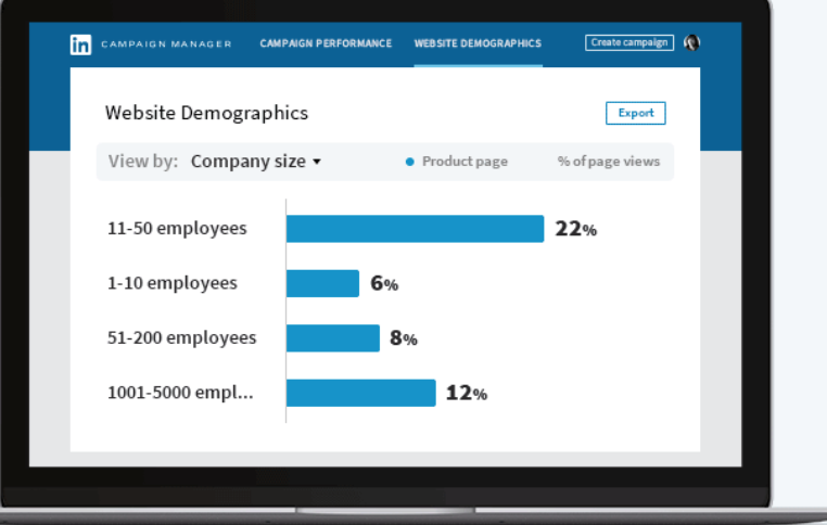
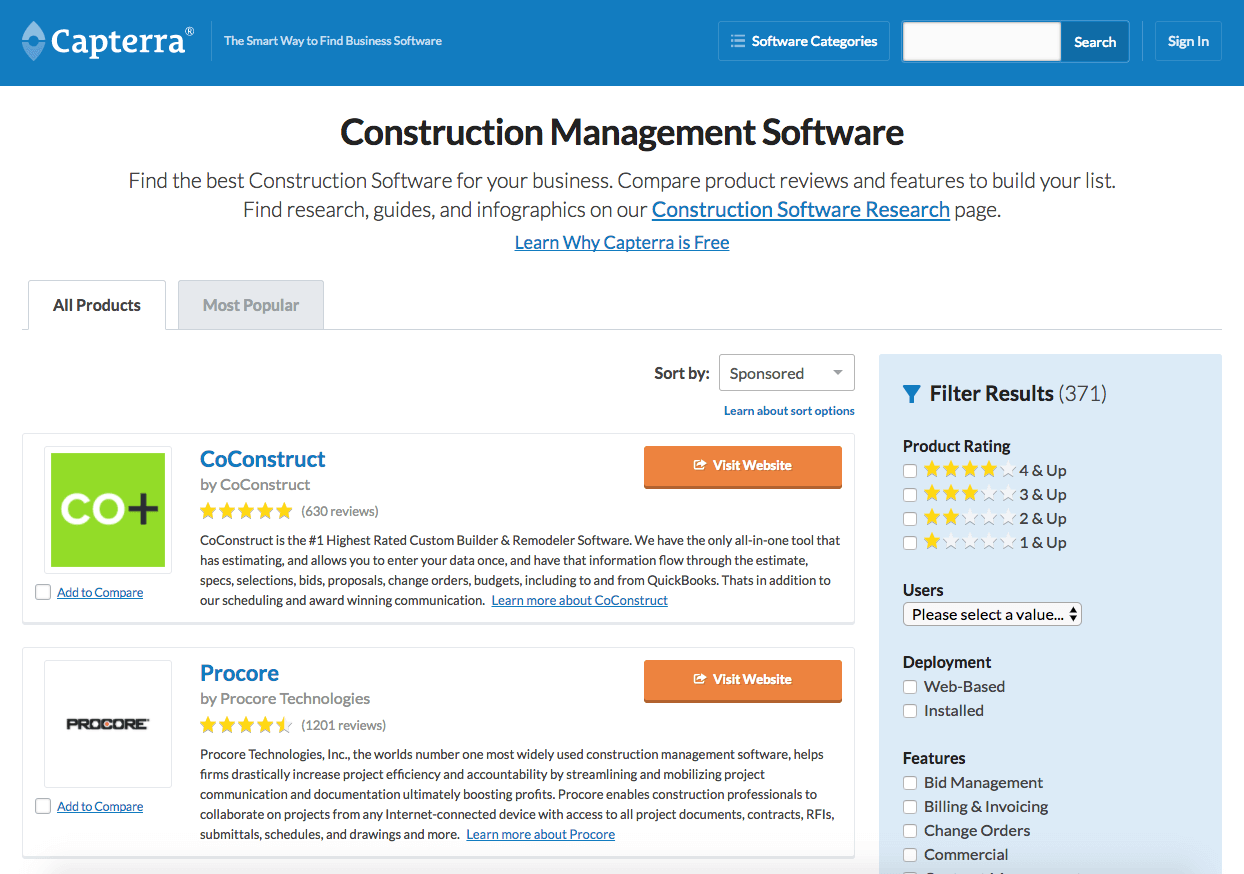
 They work with a lot of large accounts that frequently start and stop campaigns based on iterative performance. That can be a managerial nightmare. It’s incredibly time-consuming to babysit campaign performance to the required level of granularity. And the risk of missing something and overspending is high.